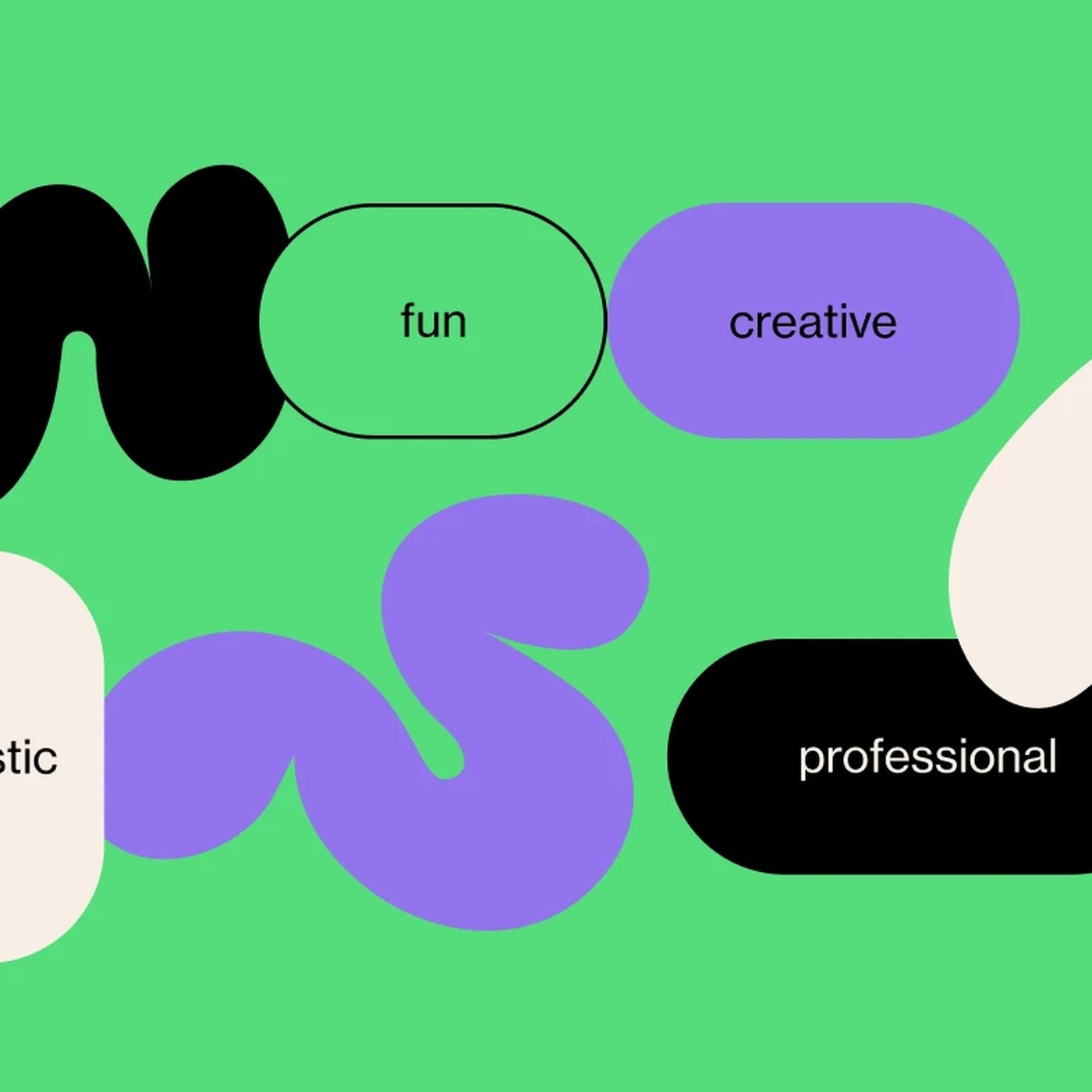
Designed by Bárbara Satler, "2FRAMES" is a striking modern typography project that redefines the balance between form and legibility. Pushing traditional boundaries in the design world, the project explores the relationship between letterforms, space, and the perception of framing from an aesthetic perspective.
Key Features of the Design
The 2FRAMES project aims to go beyond simply reading words, positioning individual letters as elements of visual composition. The geometric structures and sharp lines utilized by Satler create a strong visual hierarchy across both digital and print media. Serving as an inspiration for typography designers, this approach opens up experimental avenues, particularly in brand identity and poster design.
Impact on Digital Design and Brand Identities
In today's digital marketing and design landscape, unique typography is one of the most crucial elements that distinguishes a brand's visual language. Innovative projects like 2FRAMES offer designers the opportunity to break away from standard fonts and leave a lasting aesthetic impact on their target audience. Such experimental works serve as an important reference point, especially for projects seeking minimalist yet assertive visual narratives.
Frequently Asked Questions
In which design fields can the 2FRAMES typography project be used?
The project can be utilized as a strong visual element in original brand identities, poster designs, editorial projects, and experimental digital interface work.
What kind of advantages do such experimental typography projects provide for a brand?
By moving beyond standard fonts, they help a brand visually stand out from its competitors and build a more memorable, aesthetically rich corporate identity.
*This news article was prepared based on data published by Abduzeedo.
💬 Comments
No comments yet. Be the first!
You must be logged in to comment.
🔑 Log In