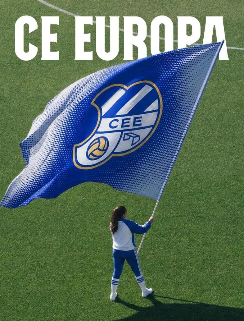
The new sports branding and visual identity project developed for CE Europa Football Club reinterprets traditional football aesthetics with modern and minimalist design lines. While preserving the club's deep-rooted history, the design work offers a streamlined visual language that adapts to digital platforms and modern merchandising trends.
Key Features of the New Visual Identity
Serving as an example of the simplification trend that has dominated football club branding processes in recent years, this project adopts an approach stripped of cluttered details. The new design promises a consistent aesthetic across a wide spectrum, ranging from the club crest and typography to the color palette and digital assets. Forms that ensure high legibility—particularly on digital screens, mobile applications, and social media—directly meet the demands of modern sports marketing.
Industry Implications
The simplification of visual identities in the sports industry plays a critical role in strengthening the bond clubs share with their fans across digital channels. The minimalist design language allows for more flexible and memorable usage in every field, from jerseys and scarves to digital posters and in-stadium signage. Such rebranding projects both enhance clubs' global recognition and appeal to the aesthetic expectations of younger generations of fans.
Frequently Asked Questions
How does this minimalist design approach strike a balance with the club's traditional identity?
Rather than completely altering the club's historical roots, the design simplifies existing elements, adapting them to contemporary visual standards and the needs of digital media.
Why are minimalist logo and identity transformations of this kind preferred by sports clubs?
Ensuring clearer visibility on small screens and mobile devices, gaining flexibility in merchandising, and establishing a modern brand perception are among the primary reasons for this transition.
*This news article was prepared based on data published by Abduzeedo.
💬 Comments
No comments yet. Be the first!
You must be logged in to comment.
🔑 Log In