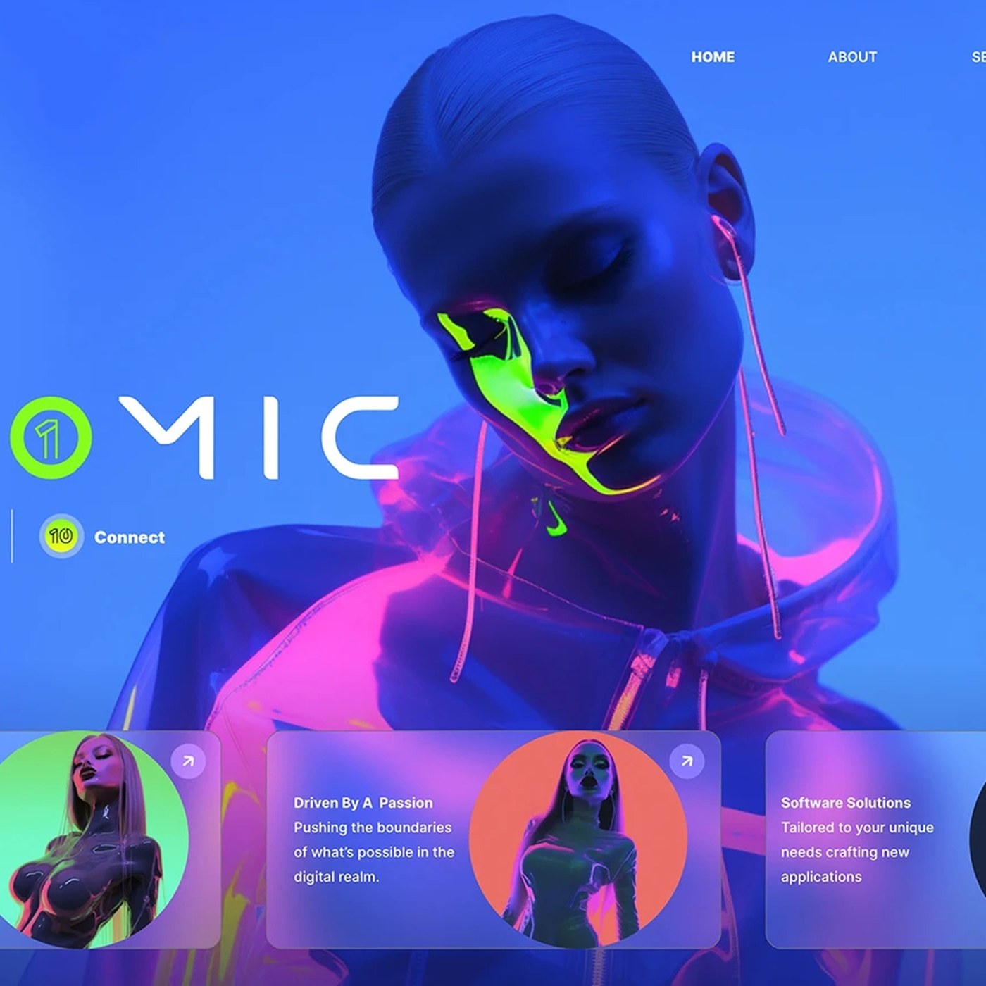
The design trends for 2025 signal a new era of visual aesthetics characterized by the combination of systematic grids—which prioritize layout and readability—and elements of typographic tension that create visual contrast. According to an analysis published by Abduzeedo, this year highlights the collision of structured designs with dynamic typefaces across both digital and print media.
The Rise of Systematic Grids
In modern digital interfaces and editorial designs, systematic grid structures are regaining popularity to flawlessly manage information hierarchy. Championing order over chaos and mathematical alignment over randomness, this approach enables users to consume complex data more quickly and intuitively. Designers are stretching strict grid systems to create compositions that are both functionally and aesthetically satisfying.
Visual Focal Points Through Typographic Tension
Typographic tension is a dynamic design technique achieved by intentionally contrasting font weights, sizes, and spacing ratios. Moving beyond standard font pairings, 2025 projects are making bold typographic choices that guide the reader's eye and practically imbue the text with a distinct character. This element of tension adds depth and movement even to minimalist designs.
Sectoral Impacts
Brands looking to break away from standard molds in visual communication and digital marketing can adopt systematic grid and typographic tension techniques to deliver more memorable and modern experiences to their target audiences. Designers who integrate these trends into their projects gain a competitive edge by balancing aesthetics with functionality.
Frequently Asked Questions
How do systematic grids affect user experience (UX) on websites?
Rigid and systematic grids enhance content scannability, allowing users to find the information they are looking for much faster and effortlessly.
What should be considered to avoid compromising readability while creating typographic tension?
When creating contrast, it is important to avoid extremes, support the contrast solely through weight rather than color or size, and ensure that the body text remains readable under all conditions.
*This news article was prepared based on data published by Abduzeedo.
💬 Comments
No comments yet. Be the first!
You must be logged in to comment.
🔑 Log In