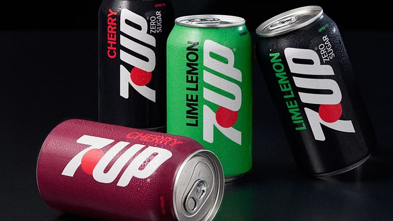
7UP has rolled out its most significant brand identity and taste update in the last 15 years, completely revamping its visual world and product formula. This comprehensive overhaul by the popular beverage brand introduces a fresh aesthetic spanning everything from packaging design to the logo.
Highlights of the New Identity
This major update—the brand's first in 15 years—blends modern design trends with 7UP's rich heritage. The renewed packaging designs and visual language aim to project a more dynamic, energetic, and contemporary stance both on digital platforms and store shelves. This revision on the design front marks a shift toward cleaner yet more striking lines in the brand's visual identity.
Industry Implications
For legacy brands in the food and beverage sector, updating long-standing identities plays a critical role in refreshing consumer perception and adapting to next-generation user habits. 7UP's move demonstrates that minimalist and modern approaches will remain at the forefront of packaging design and brand positioning processes, while updates to the flavor profile will also be a defining factor for brand loyalty.
Frequently Asked Questions
What exactly does 7UP's biggest update in the last 15 years encompass?
The update is a comprehensive renewal process covering both the brand's visual identity (logo and packaging design) and its product flavor profile.
How do major brand overhauls of this scale impact consumer perception and the industry?
Such moves enable brands to appeal to next-generation consumers, boost their competitive edge on shelves, and set a visual trend reference for other players in the industry.
*This news article was prepared based on data published by Creative Bloq.
💬 Comments
No comments yet. Be the first!
You must be logged in to comment.
🔑 Log In