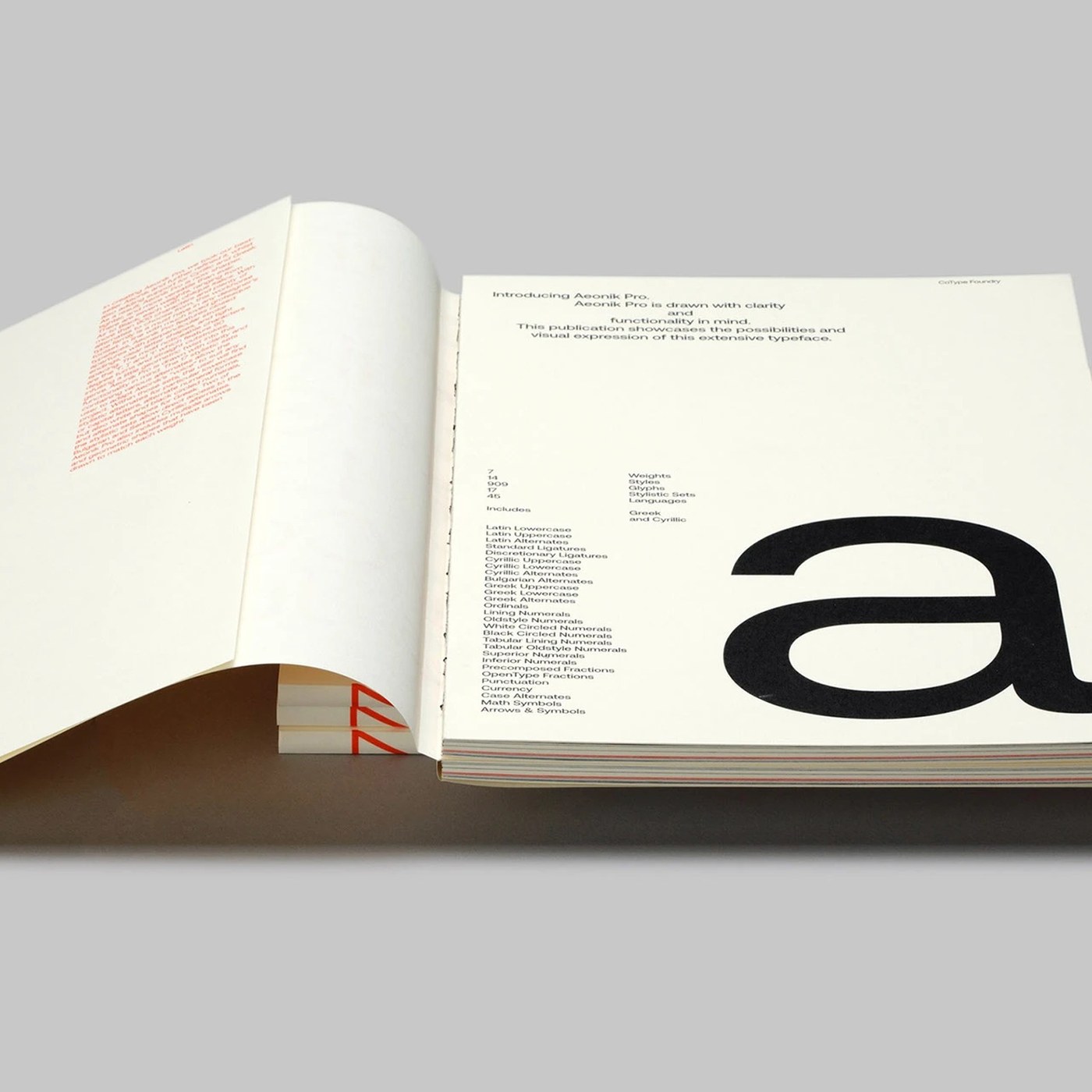
Developed by Mash Creative, the Aeonik Pro sans-serif variable font family has been announced with new design features and specimen details centered around the concept of "visual tension" in typography. This updated typographic work showcases dynamic transitions between font weights and axes, alongside its application areas in modern design projects.
Visual Tension in Design and Variable Font Dynamics
Variable fonts offer digital designers immense flexibility by allowing unlimited weight and width variations within a single file. The Aeonik Pro specimen study examines how this flexibility strengthens typographic hierarchy and commands attention by creating tension in brands' visual identities. Maintaining readability while projecting an aesthetic stance—especially across screen designs and print media—is made possible through this variable structure.
Industry Implications and Use Cases
The use of variable fonts is rapidly growing in modern UI design, corporate identity projects, and editorial initiatives. Professional font families like Aeonik Pro enable designers to precisely adjust the most suitable character thickness for their projects, optimizing file sizes while enhancing typographic consistency.
Frequently Asked Questions
What is the primary technical feature that sets the Aeonik Pro font family apart from traditional sans-serif fonts?
Aeonik Pro utilizes variable font technology, which allows for dynamic weight and axis changes within a single file, offering designers a broader range of customization.
How does the concept of visual tension translate into an advantage in typography projects?
Visual tension draws the viewer's attention to the text through character proportions and contrast, lending a modern, dynamic, and memorable character to the design.
*This news article was prepared based on data published by Abduzeedo.
💬 Comments
No comments yet. Be the first!
You must be logged in to comment.
🔑 Log In