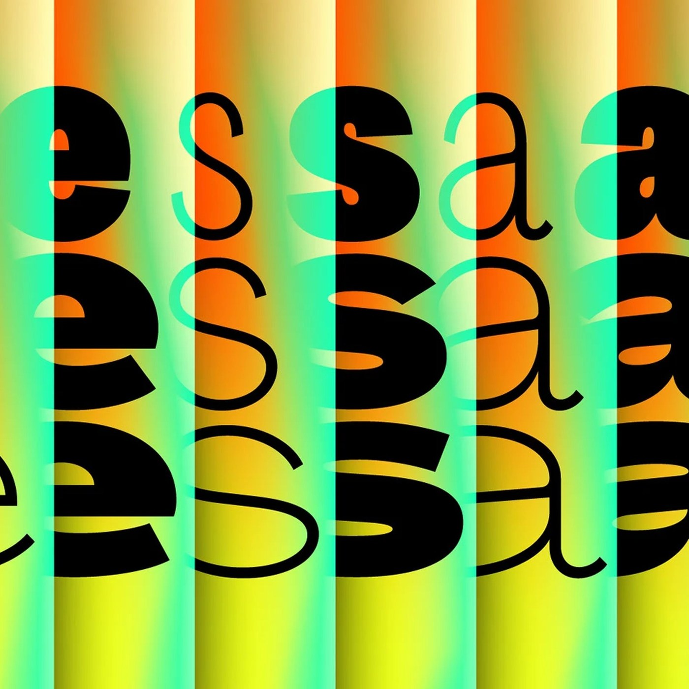
Developed by designer Alex Slobzheninov, Agrandir is a new variable font project that brings together bold and imperfect typographic forms. Challenging traditional smooth lines, this typeface offers an alternative visual language for those seeking a strong and characteristic aesthetic in both digital and print designs.
Key Design Features and Structure
Agrandir stands out with its structure, which blends imperfect and bold strokes with modern typography trends. Unlike standard geometric fonts, this typeface family embraces organic and compressed forms, and is specifically designed to deliver a strong visual presence in headline designs and branding projects. Its support for variable font technology provides designers with flexible control over weight and width axes.
Industry Implications and Use Cases
Experimental and character-driven typefaces of this kind are critical tools for brands looking to stand out from their competitors in digital marketing and interface design. Agrandir offers a flexible structure that enhances visual storytelling, particularly for designers aiming to establish eye-catching typographic hierarchies on the websites of fashion, art, and technology companies, as well as creative agencies. Thanks to its variable font architecture, it can be optimized across different screen sizes without compromising web performance.
Frequently Asked Questions
How is performance optimization achieved when using the Agrandir typeface in web projects?
Thanks to variable font technology, different weights and widths can be achieved through a single file instead of loading multiple files. This reduces the HTTP request load and contributes positively to site speed.
In which brand identities do flawed and experimental typographies of this style create the highest impact?
They are ideal for creating a strong sense of character and originality in creative industries, independent media platforms, fashion brands, and digital art projects that wish to step outside traditional corporate boundaries.
*This news report has been prepared based on data published by Abduzeedo.
💬 Comments
No comments yet. Be the first!
You must be logged in to comment.
🔑 Log In