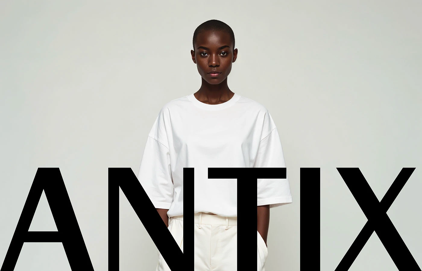
The Antix digital product identity has been restructured with a minimalist design approach that combines simplified visual elements, functionality-driven typography, and modern color palettes. This new identity project aims to strip away complex interfaces and digital assets, offering users a clearer, more fluid experience where the product itself remains the focal point.
The Balance of Minimalism and Functionality in Design
During Antix's brand identity renewal process, clean lines and generous negative space were prioritized to minimize visual noise. In the world of digital products, where users have limited attention spans, a minimalist approach is not merely an aesthetic choice but also a practical necessity. The design language enables users to navigate the platform without fatigue while reinforcing the brand's innovative and professional stance.
New Trends in Digital Product Identities
Today, digital product design is evolving toward systems that offer maximum readability and speed by avoiding excessive ornamentation. As seen in the Antix example, the use of a limited color palette and a strong typographic hierarchy makes it easier for brands to maintain a consistent appearance across various screen sizes and devices. This approach enhances brand consistency, particularly under mobile-first design standards.
Sectoral Reflections
The adoption of minimalist aesthetics in digital product development processes is not just a visual change; it is also a strategic decision that directly optimizes user experience (UX). Eliminating complex menus and unnecessary graphics improves loading times while allowing users to reach their goals in a shorter time.
Frequently Asked Questions
How does minimalist brand identity design affect loading performance in digital products?
The use of fewer complex graphic elements and optimized typography reduces the load on the browser, indirectly contributing to faster page load times.
How is brand awareness preserved during such a visual simplification process?
A consistent color palette, a strong typographic hierarchy, and distinctive logo details ensure that the brand retains its place in the user's mind, even when visual elements are reduced.
*This news article was prepared based on data published by Abduzeedo.
💬 Comments
No comments yet. Be the first!
You must be logged in to comment.
🔑 Log In