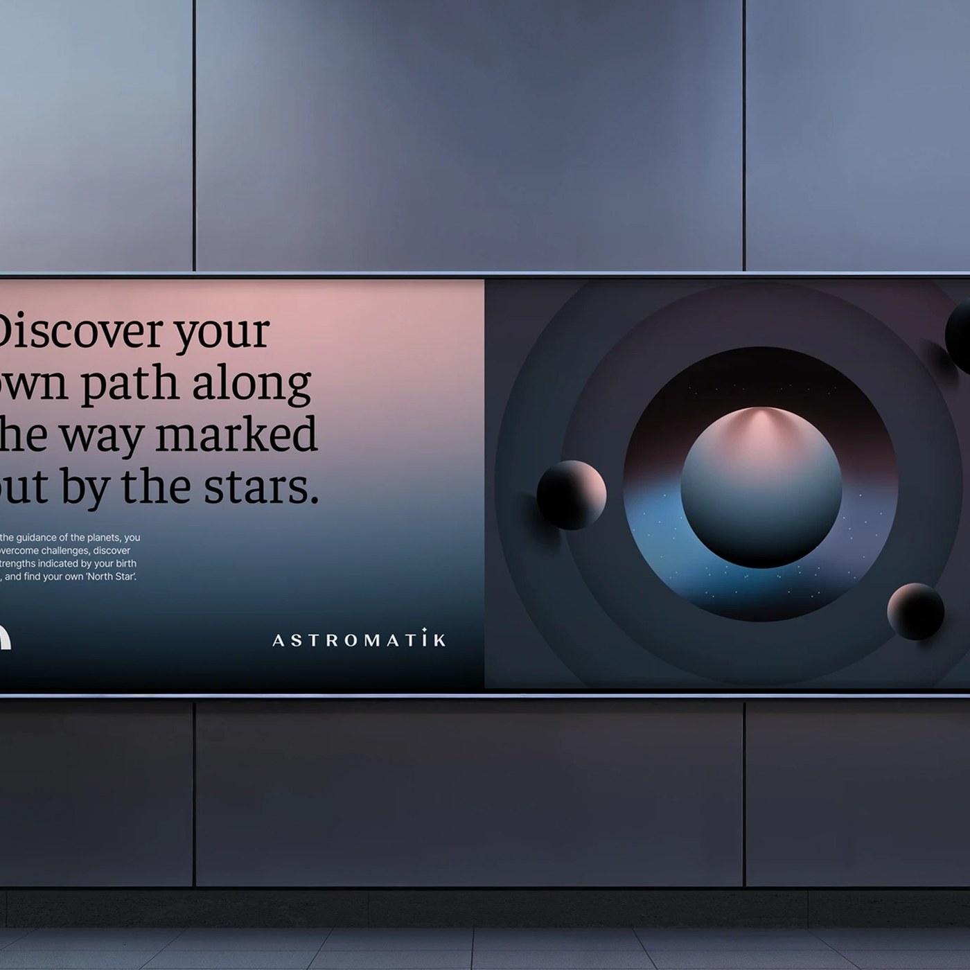
The interface and brand identity of the Astromatics app have been completely redesigned by designer Sencer B. Yılmaz in line with modern digital standards. This comprehensive overhaul aims to optimize user experience (UX) flows while giving the user interface (UI) a more aesthetic and intuitive structure.
Highlights in Design and Brand Identity
The redesign process is not merely a visual makeover, but rather a bridge connecting the app's foundational brand identity with contemporary digital trends. In Sencer B. Yılmaz’s work, the digital translation of astrological and cosmic themes has been revisited through minimalist and legible typography.
- Visual Hierarchy: A simplified information architecture was established to ensure that complex data and astrological charts are easily digestible for the user.
- Color Palette and Typography: Deep tones that evoke space and the cosmos were balanced with legible font sets adhering to modern UI principles.
User Experience (UX) Improvements
The app's navigation structure was optimized from the ground up, allowing users to access daily horoscopes, detailed analyses, and personalized content with a minimum number of taps. Designed with mobile thumb ergonomics in mind, the new button placements and flows aim to increase overall interaction time and user satisfaction within the app.
Industry Implications
For niche-focused mobile apps, the simplicity of the user interface and the consistency of the brand identity play a critical role in digital product success. Astromatics' redesign process stands out in digital design circles as a successful UI/UX case study where aesthetics and functionality are balanced.
Frequently Asked Questions
How does a redesign process impact user retention in such niche mobile apps?
UX/UI updates that simplify complex data and enhance accessibility generally increase the time users spend in the app, positively reflecting on daily active usage rates.
How are aesthetics and functionality balanced in Sencer B. Yılmaz’s Astromatics project?
Visual elements suited to cosmic and astrological themes were combined with minimalist typography and an optimized information hierarchy, enabling users to access information effortlessly.
*This news article was prepared based on data published by Abduzeedo.
💬 Comments
No comments yet. Be the first!
You must be logged in to comment.
🔑 Log In