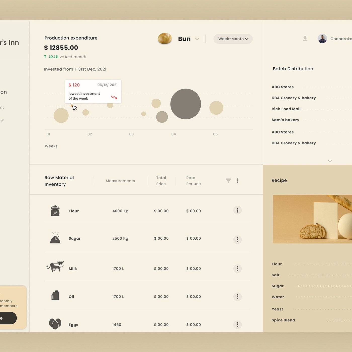
Developed by designer Dnyanesh Maid, the "Bakker's Inn" dashboard UI design is a modern interface project that presents complex data in a user-friendly, minimalist, and functional structure. Featured on Abduzeedo, this concept offers aesthetic and practical solutions designed for businesses such as bakeries or cafe chains to easily manage inventory, sales, and operational processes from a single screen.
Key Features of the Design
The Bakker's Inn interface is built on optimizing the user experience (UX) in data-heavy control panels. The most striking aspects of the work include:
- Minimalist Data Visualization: Sales charts, inventory status, and customer traffic analysis are presented in easily readable chart formats, free from complex tables.
- Color Palette and Typography: The balanced use of soft, easy-on-the-eyes tones combined with contrasting colors that highlight critical data enhances the interface's readability.
- Modular Layout: Frequently accessed areas such as order tracking, staff management, and instant notifications are positioned in a hierarchical order using a grid system.
Industry Implications
Modern dashboard designs of this nature directly increase user engagement in digital marketing and business management tools. By prioritizing aesthetics while maintaining a loyal information architecture in similar interface projects, developers and UI/UX designers can accelerate decision-makers' business workflows.
Frequently Asked Questions
What tools might have been used to create the Bakker's Inn dashboard design?
Modern UI/UX projects of this type are typically prototyped using interface design programs such as Figma, Adobe XD, or Sketch.
How is a dashboard design like this transitioned to the web development phase?
Once the design is finalized, components are converted into a design system and coded using modern frontend frameworks like React or Vue, alongside Tailwind CSS.
*This news article was prepared based on data published by Abduzeedo.
💬 Comments
No comments yet. Be the first!
You must be logged in to comment.
🔑 Log In