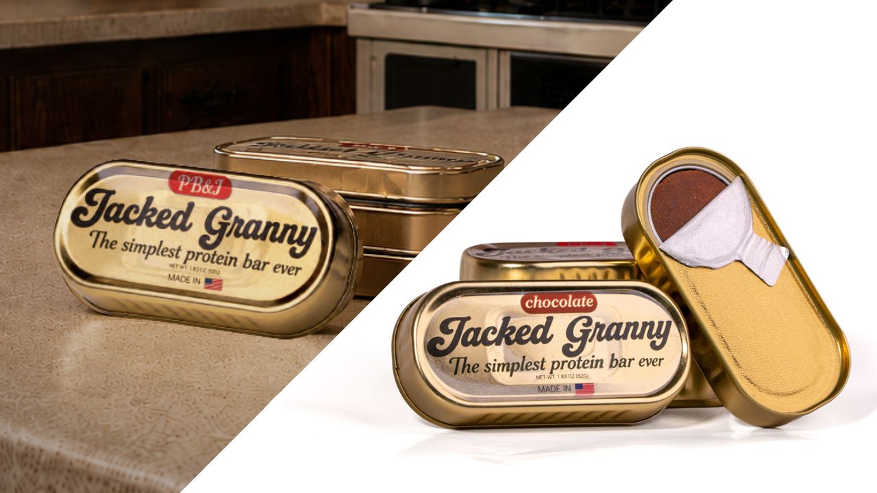
The fish illustrations used on protein bar packaging, which may seem unusual at first glance, are a deliberate marketing and design strategy entirely aimed at emphasizing the product's unusual nutritional profile and naturalness. According to details reported by Creative Bloq, this unconventional packaging choice sparks consumer curiosity and helps the product stand out on the shelves.
Breaking the Mold in Packaging Design
The traditional sports nutrition and protein bar category typically features minimalist typography, stark colors, or dynamic visuals directly symbolizing muscle and energy. However, the fish-themed illustration chosen in this example shakes up consumer perception and breaks visual conventions in the category. The design team aims to turn the packaging itself into a storytelling tool, prompting users to examine the product and become curious about its ingredients.
Consumer Perception and Digital Marketing Impact
Bold design moves of this kind go beyond merely grabbing attention on physical shelves; they are crucial for generating organic engagement on digital marketing and social media platforms. The tendency of consumers to photograph and share packaging they find unusual grants brands extensive visibility without incurring additional advertising costs.
Frequently Asked Questions
In which sectors do such unusual packaging designs turn into a greater advantage?
Especially in highly competitive sectors such as food, cosmetics, and fast-moving consumer goods (FMCG), deviating from the traditional visual language helps brands rise above the clutter on shelves or screens.
What dynamics must packaging design possess to be shareable on social media?
Humor, unexpected visual combinations, or intriguing details directly increase the motivation of users to share products on their personal accounts.
*This news report has been prepared based on data published by Creative Bloq.
💬 Comments
No comments yet. Be the first!
You must be logged in to comment.
🔑 Log In