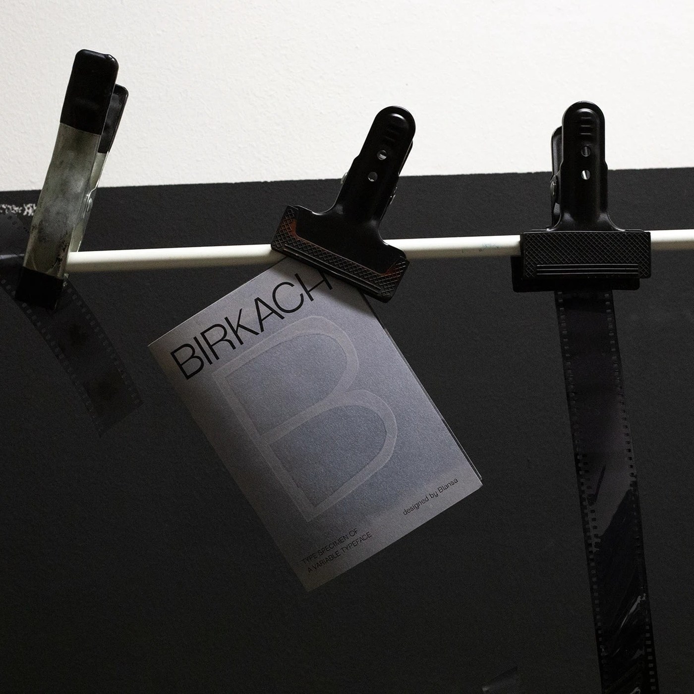
The Birkach Typeface Specimen Blanka Burgundi is an experimental and striking type specimen project that highlights raw and organic visual rhythm in typography design. Published on the Abduzeedo platform, this work breaks away from traditional typographic rules to redefine the balance between aesthetics and readability in modern digital design processes.
Design Philosophy and Visual Rhythm
The Blanka Burgundi project aims to move letterforms away from traditional geometric structures, giving them a more fluid and aggressive visual rhythm. The "raw" textures often overlooked in typography design are blended in this specimen with the sharp lines offered by digital media. Designers prefer such experimental typefaces particularly to create a compelling visual focal point in brand identity, poster design, and digital art projects.
Use Cases in Digital Design
Original typography specimens of this style serve as a source of inspiration for digital marketers and UI designers looking to step outside standard font libraries. Particularly in social media visuals, editorial web designs, and modern typographic posters, raw visual rhythms stand out as a powerful aesthetic element that boosts user engagement.
Sectoral Reflections
Such original typography works are considered a balancing element against the minimalism trend in the design world. The shift of brands toward fonts with character and a narrative, rather than ordinary fonts on digital platforms, indicates that experimental approaches and raw aesthetics will become more dominant in future brand identity designs.
Frequently Asked Questions
In which projects do experimental typography specimens like Blanka Burgundi yield the highest impact?
Such specimens yield the best results in areas with high creative freedom, such as poster designs, music album covers, conceptual websites, and striking brand announcement visuals.
What steps should designers follow to capture raw visual rhythm in their own projects?
Instead of using standard fonts directly, playing with letter spacing (kerning), combining different weights, and integrating digital or analog textures into the typography strengthens this effect.
*This news article was prepared based on data published by Abduzeedo.
💬 Comments
No comments yet. Be the first!
You must be logged in to comment.
🔑 Log In