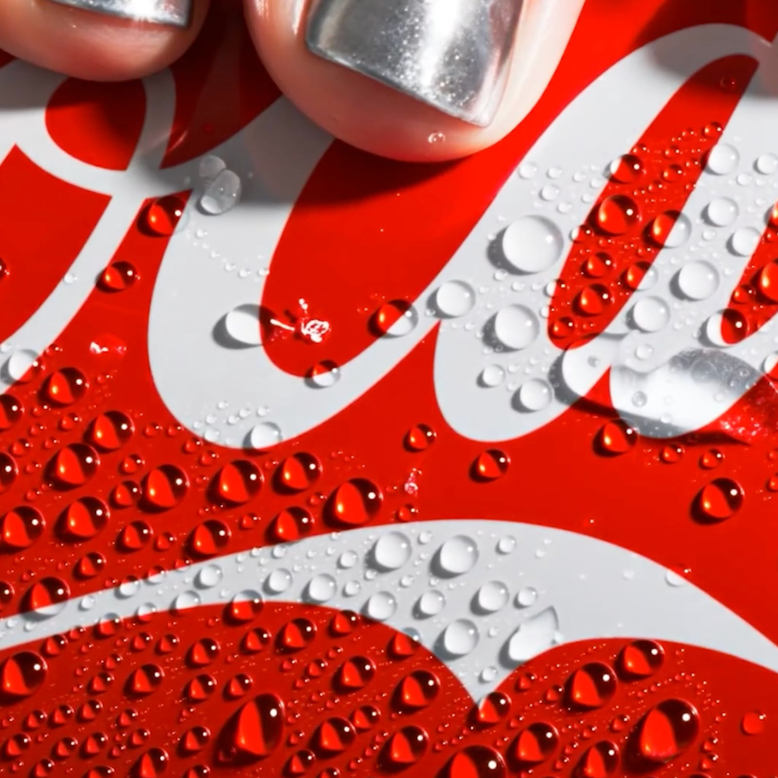
Coca-Cola has updated its global visual identity to increase brand consistency worldwide and strengthen its presence on digital platforms. This new design language offers a clean and functional approach that preserves the brand's iconic assets while adapting to modern marketing needs.
Focal Points and Design Details of the New Visual Language
The revamped visual identity project aims to create a cleaner aesthetic, particularly in packaging designs, digital interfaces, and advertising channels. While Coca-Cola's long-standing core color palette remains intact, the layout of elements and typography have been streamlined. This move allows the brand to be recognized more quickly both on physical shelves and across digital channels such as mobile screens and social media.
Industry Implications and Brand Identity Strategies
The simplification of visual identities by large-scale global brands is among the leading digital marketing trends today. Stripping away complex details improves the user experience—especially on small screens—while boosting brand awareness. Coca-Cola's move stands out as part of a strategy to project a consistent global image without losing flexibility in local markets.
Frequently Asked Questions
What practical differences does this visual identity change create on the brand's packaging?
The update reduces cluttered elements on the packaging, allowing the iconic logo and colors to be positioned more prominently and legibly.
Why have global brands recently been favoring simpler design languages?
The growing weight of mobile devices and digital screens in marketing makes it essential for logos and visual elements to be easily perceived even at small sizes.
*This news story was prepared based on data published by Abduzeedo.
💬 Comments
No comments yet. Be the first!
You must be logged in to comment.
🔑 Log In