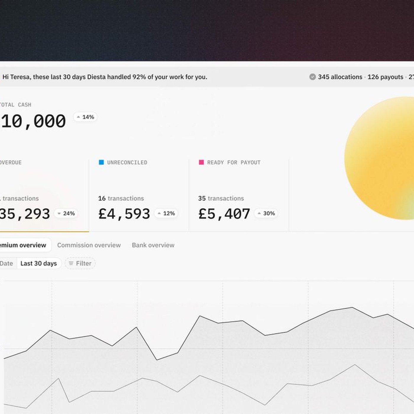
The new user interface developed to optimize the insurance payment processes of the Diesta platform has launched in the digital world with a design by Significa.co. This new interface project aims to maximize user experience (UX) by simplifying complex financial and insurance transactions.
Key Design Features and Ease of Use
Crafted by Significa, the Diesta interface was designed with a minimalist approach to enable users to manage their policies and track payments with the fewest possible clicks. Placing a strong emphasis on visual hierarchy, the project supports data-dense insurance operations with clear graphics and modern typography elements. The goal is to minimize the cognitive load experienced by users while fulfilling their financial obligations.
The UX Approach in Financial Technologies
In the fields of digital insurance and insurtech, user interface design is of critical importance for customer loyalty and conversion rates. Diesta's new design serves as a current example of how a user-centric approach can be integrated into financial platforms. Transparent and rapid management of processes increases users' trust in the platform while directly supporting operational efficiency.
Frequently Asked Questions
Which user group does Diesta's new interface design target?
The design offers a simplified structure targeting both individual insurance policyholders and corporate-level professionals who handle heavy payment and financial tracking workloads.
How do interface updates of this kind affect the usage metrics of platforms?
Modern interfaces that reduce transaction steps and prevent visual clutter shorten user task-completion times, positively impacting overall satisfaction and retention rates on the platform.
*This news is based on information prepared utilizing data published by Abduzeedo.
💬 Comments
No comments yet. Be the first!
You must be logged in to comment.
🔑 Log In