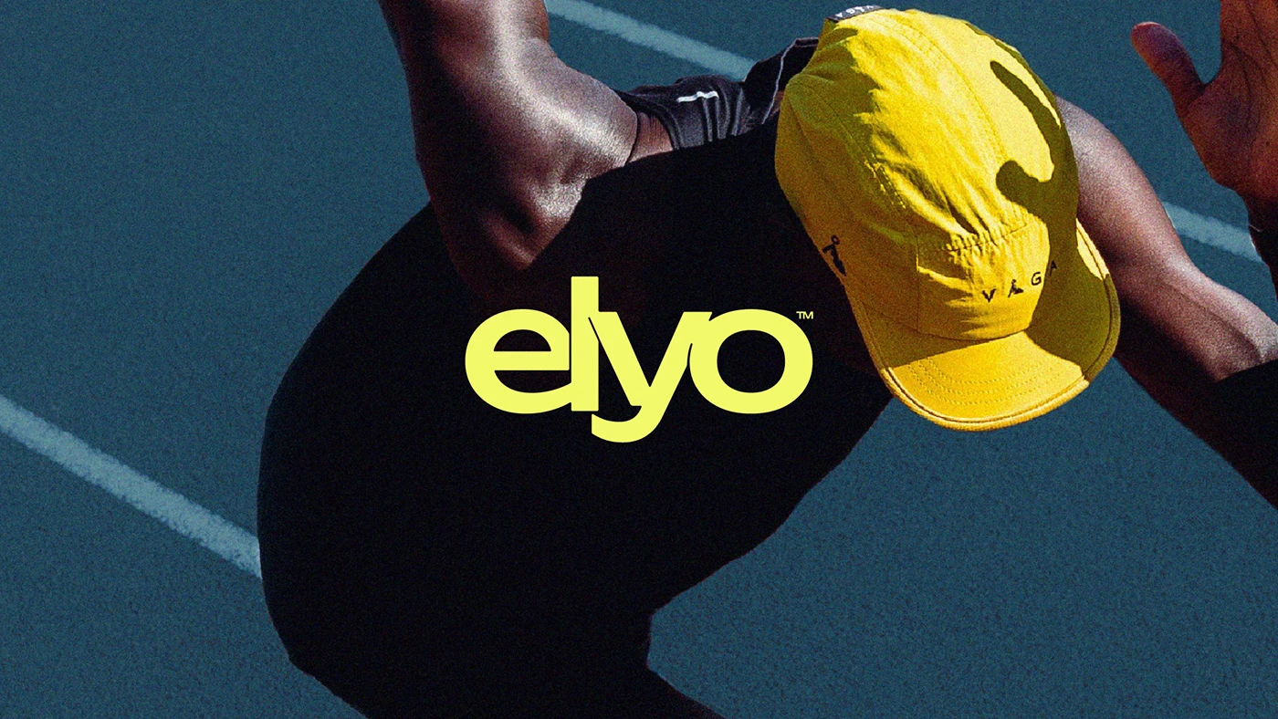
The ELYO brand identity project delivers a consistent aesthetic across digital and print media through a minimalist design approach that highlights clean lines and functionality. Featured on Abduzeedo, the project clearly demonstrates how modern design trends are integrated into corporate identity processes.
Key Elements of Minimalist Design
The project stands out with typography choices stripped of complex details and understated color palettes. In this approach, which strengthens visual hierarchy, every design element is intended to convey the brand message directly. Minimalism is positioned not merely as an aesthetic preference, but also as a functional tool that simplifies the user experience.
Sectoral Implications and Takeaways for Designers
Such minimalist corporate identity projects enable brands to be perceived more quickly and memorably in the digital world. Especially in today's digital marketing ecosystem, dominated by mobile screens and clean interfaces, creating maximum impact with fewer elements has become a fundamental strategy for designers.
Frequently Asked Questions
How does the typography choice in the ELYO brand identity project affect brand perception?
The clean and modern fonts used in the project support the brand in projecting an innovative, professional, and easily understandable stance.
What advantages do such minimalist visual identities offer in digital marketing?
They ensure high readability across different screen sizes, allow for the use of streamlined graphic files that optimize loading times, and establish a strong visual integrity on platforms like social media.
*This news report has been prepared based on data published by Abduzeedo.
💬 Comments
No comments yet. Be the first!
You must be logged in to comment.
🔑 Log In