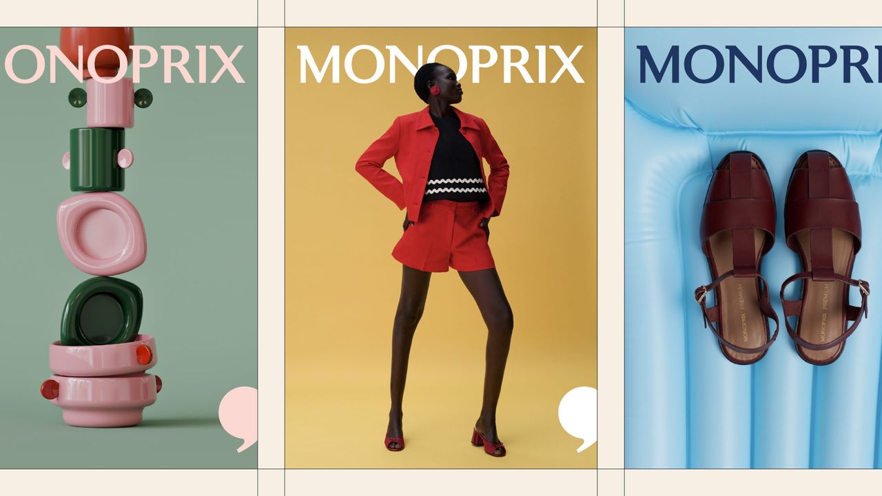
French supermarket chain Monoprix has rolled out a comprehensive rebranding operation aimed at revitalizing its iconic status. Making waves in the design world, this new visual identity captures attention with a clean and effective design language that stays true to the brand's deep-rooted history while adapting to modern digital trends.
Key Features of the New Design
Monoprix's new brand identity is built upon a clutter-free, minimalist, and functional visual approach. During the renewal process, the emblem and typography were reworked to ensure greater legibility and memorability, both on digital screens and physical store shelves.
The designers' focus was to preserve the brand's decades-long place in French retail culture while integrating it into today's consumer habits. In particular, the typographical adjustments and the simplified color palette deliver a consistent user experience across a wide spectrum, ranging from packaging design to digital advertising.
Industry Implications
From a design and digital marketing perspective, it has become a global trend for heritage brands to return to their roots by avoiding excessive complexity during rebranding processes. Monoprix's move stands out not merely as an aesthetic touch-up, but as a strategic step that enhances the brand's recognition both in shelf competition and across digital channels. At a time when consumers are gravitating toward simple and authentic designs, iconic brands modernizing their identities while preserving their original roots continues to be a critical factor in reinforcing brand loyalty.
Frequently Asked Questions
Which visual elements does Monoprix's new identity design bring to the forefront?
The new design centers around minimalist typography, a streamlined color palette, and a functional visual language that offers maximum readability on both physical shelves and digital screens.
How do such simplification operations by heritage brands impact digital marketing?
Streamlined brand identities directly improve the user experience by ensuring that logos and visuals are perceived more clearly and quickly on digital platforms such as mobile apps, e-commerce sites, and social media.
*This news article was prepared based on data published by Creative Bloq.
💬 Comments
No comments yet. Be the first!
You must be logged in to comment.
🔑 Log In