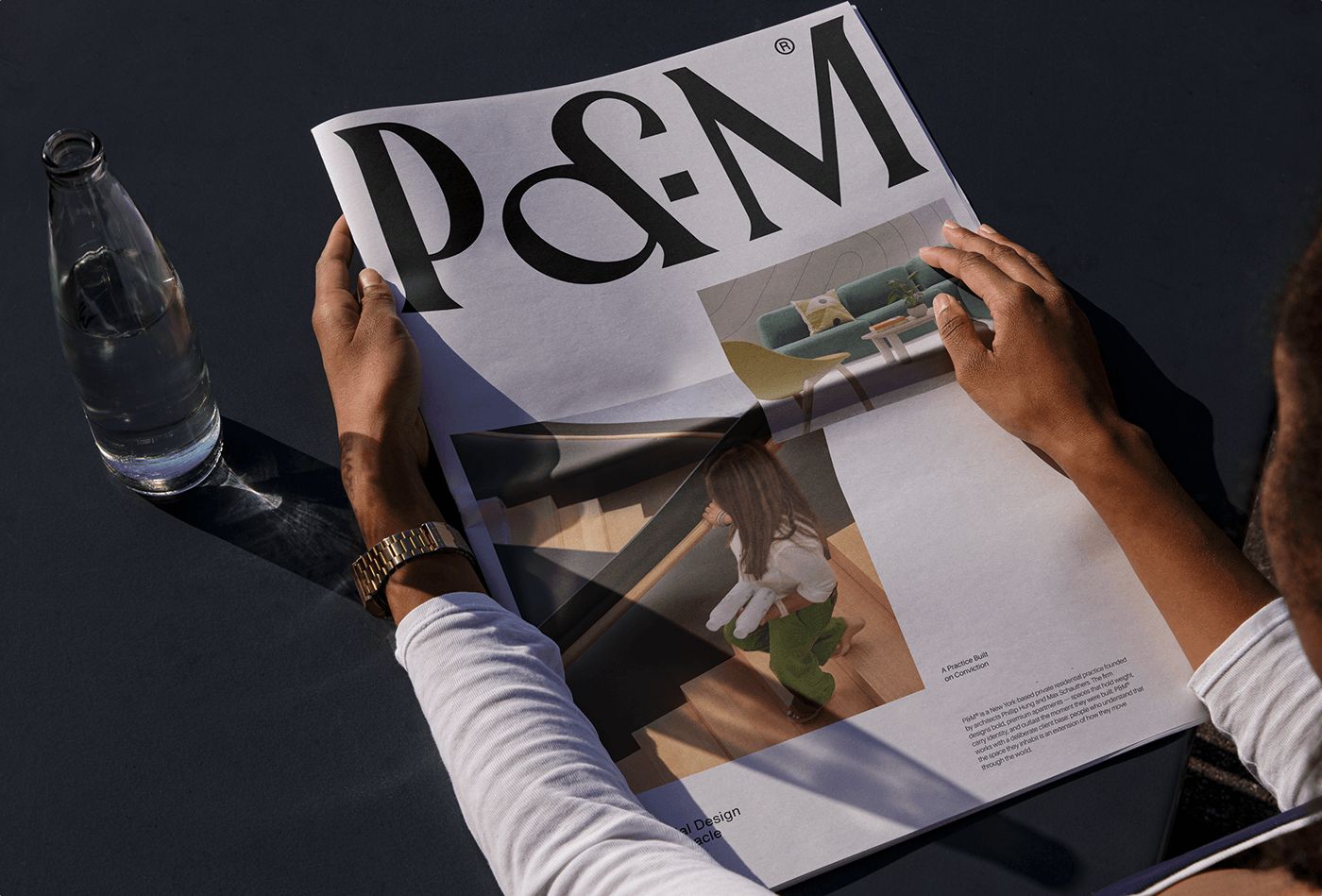
Designer Gideon Phillip has created a visually striking and minimalist corporate identity project for the PM brand, dominated by a monochromatic palette. Leveraging the contrasting power of black and white, this new design approach redefines the brand's positioning across digital and print media with a simple yet memorable aesthetic.
Details of the Monochromatic Approach in Design
The concept developed by Phillip for PM delivers a pure aesthetic stripped of chromatic clutter. The design language is built upon typographic hierarchy, sharp lines, and high-contrast black-and-white tones. This choice aims to directly reflect the brand's modern, decisive, and professional identity.
Identity projects utilizing just two primary colors grant brands significant flexibility in terms of scalability. A consistent visual integrity can be maintained across every medium, ranging from packaging and digital interfaces to stationery and outdoor advertising.
Industry Reflections
In today's design world, a growing trend is observed toward simpler, focused, and timeless lines, moving away from complex color palettes. Monochromatic corporate identities offer the advantage of leaving a sophisticated impression on the target audience without creating visual noise. The PM project serves as a strong reference for how a minimalist design philosophy can strengthen brand perception.
Frequently Asked Questions
In which sectors are monochromatic brand identity designs more advantageous?
Single-color or black-and-white dominant identities deliver a higher visual impact in sectors seeking to project a minimalist, prestigious, and modern image, such as fashion, architecture, technology, and luxury consumption.
How does using only black and white affect accessibility in digital marketing?
Because high-contrast black-and-white designs enhance text readability, they facilitate compliance with user experience (UX) and web accessibility standards on websites and mobile applications.
*This news article was prepared based on data published by Abduzeedo.
💬 Comments
No comments yet. Be the first!
You must be logged in to comment.
🔑 Log In