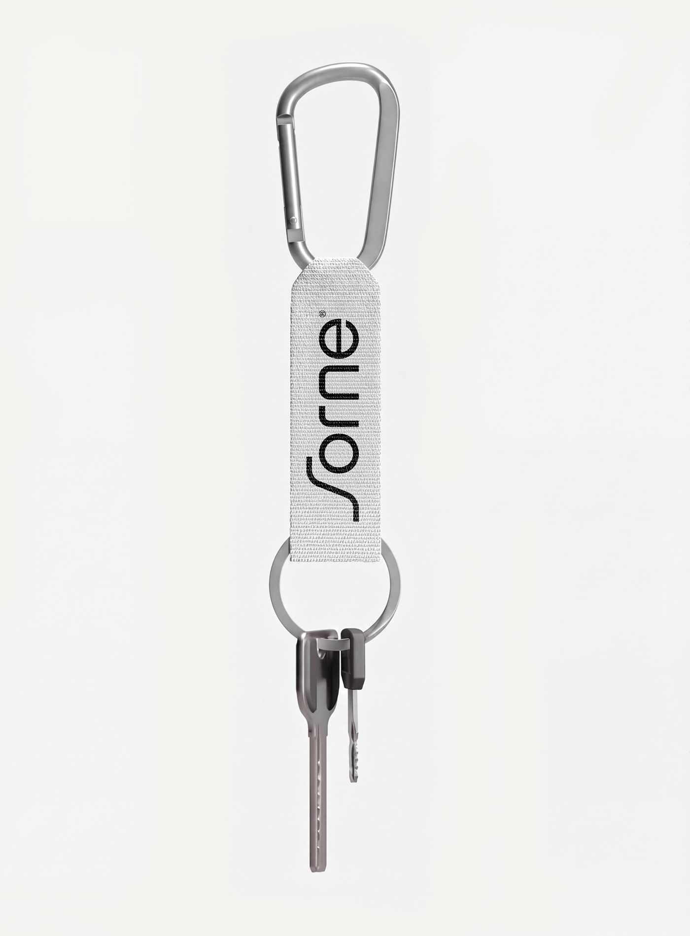
Designer Gideon Phillip has launched a new grid-based corporate identity project for the Sorne brand, bringing together mathematical precision and modern aesthetics. This work highlights how structural order and geometric alignment can strengthen visual communication during the brand identity creation process.
The Impact of the Grid System on Design
In Gideon Phillip's project for Sorne, a strict grid structure was adopted as the foundational design approach. This method ensures the creation of a consistent and balanced visual language across all brand elements, ranging from the logo and typography to packaging design and digital platforms. By prioritizing mathematical proportions and alignment rules, this approach fosters a minimalist, clutter-free, and memorable brand perception.
Industry Implications
In the modern world of digital marketing and design, corporate identity projects must not only be aesthetic but also easily adaptable to various screen sizes and physical materials. While grid-based design systems provide designers with flexibility, they also help brands maintain a consistent visual stance in the long run. The Sorne project stands out as a contemporary application of this methodology.
Frequently Asked Questions
What advantages do grid-based corporate identity designs offer brands?
Grid systems play a critical role in establishing visual consistency, seamless adaptability across different mediums, and a professional aesthetic perception.
What are the key design elements that stand out in Gideon Phillip's Sorne project?
The project highlights geometric alignment, mathematical proportions, minimalist typography choices, and a strong visual balance.
*This news article was prepared based on data published by Abduzeedo.
💬 Comments
No comments yet. Be the first!
You must be logged in to comment.
🔑 Log In