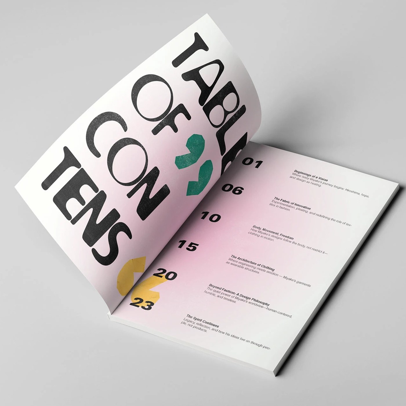
The Issey Miyake magazine project, crafted by designer Günay Hasanova, is a comprehensive conceptual study that merges the brand's avant-garde aesthetic with modern typography and innovative editorial design approaches. Featuring minimalist page layouts, bold visual placements, and details that reflect the brand's fashion philosophy, this special specimen study offers an inspiring example for both digital and print publishing.
Minimalism and Typographic Balance in Editorial Design
Issey Miyake’s deconstructivist and sculptural lines in the fashion world form the core design language of Hasanova's magazine project. The negative space utilized in the page architecture translates the draping and form play of the garments into a digital plane. In typographic choices, balancing readability with artistic expression directly reinforces the brand's modern and timeless identity.
Key Features of the Project
- Visual Hierarchy: The design establishes a dynamic balance between imagery and text, breaking traditional molds.
- Form and Functionality: The minimalist approach enhances the aesthetic value of the magazine without compromising its readability.
- Brand Alignment: Issey Miyake’s industrial and innovative approach to fashion mirrors the geometric forms found throughout the page layouts.
Industry Implications
Conceptual editorial designs of this nature highlight fashion brands' efforts to be more than just product sellers—they strive to become powerful visual storytellers. At a time when the boundaries between digital and print mediums are blurring, such typography and layout experiments serve as vital reference points steering the future trends of magazine design.
Frequently Asked Questions
How do conceptual design studies of this kind contribute to the corporate identity of fashion brands?
Independent or conceptual projects of this nature allow brands to refresh their innovative visions, enrich their visual archives, and connect with creative communities.
Why does the aesthetic of print magazines remain a key focus for designers in the age of digital publishing?
The discipline of print publishing offers designers the purest and most controllable playground for strict visual hierarchy, page architecture, and typographic details, thereby continuing to serve as a direct source of inspiration for digital interface designs.
*This news article was prepared based on data published by Abduzeedo.
💬 Comments
No comments yet. Be the first!
You must be logged in to comment.
🔑 Log In