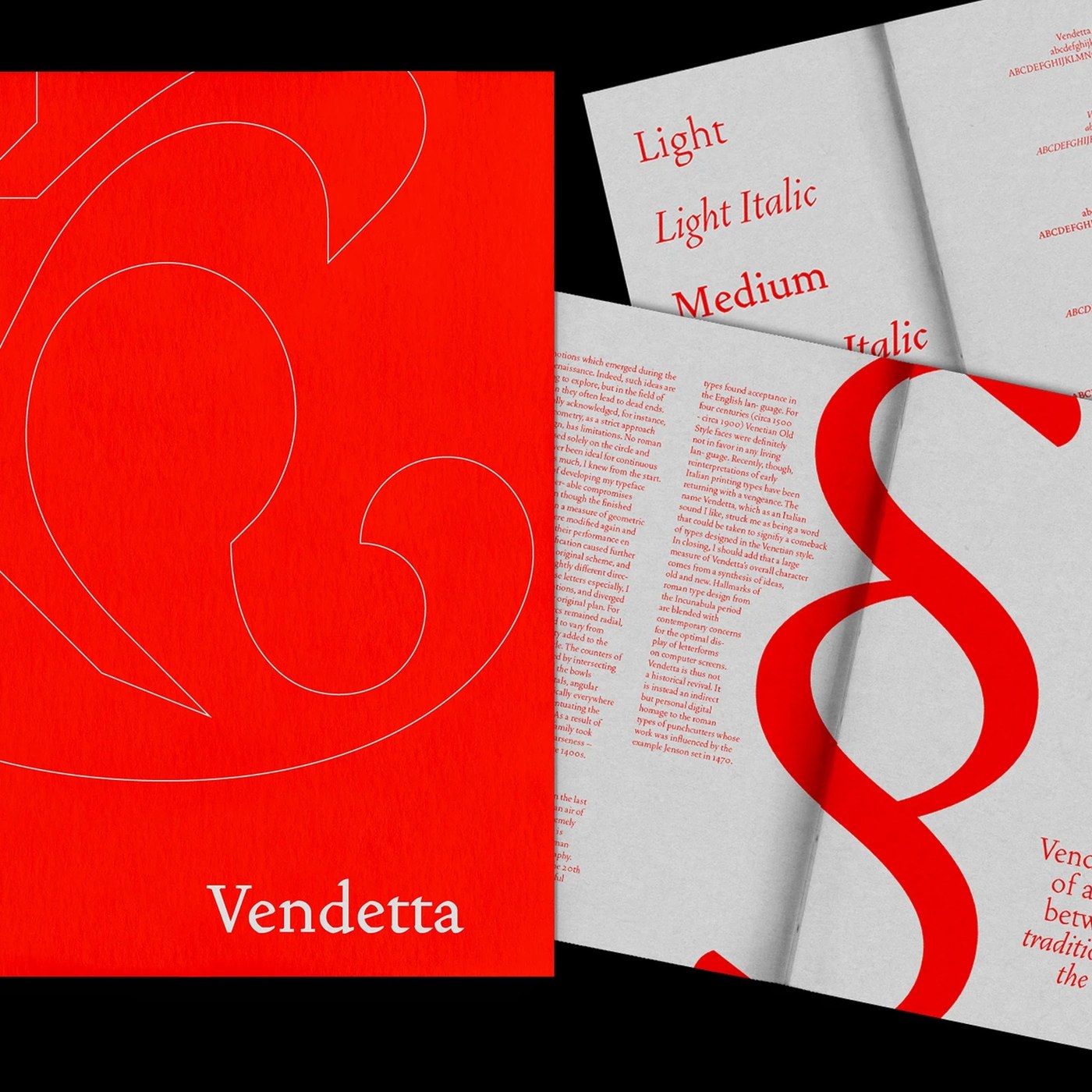
This week's standout design trends focus on high-contrast color systems and monospaced grid structures, which elevate readability and modern aesthetics. Compiled by Abduzeedo, the weekly selection highlights how these two major currents blend in contemporary designs to strengthen visual hierarchy and deliver technical precision across digital interfaces and print media.
The Rise of High-Contrast Systems in Design
High-contrast color systems have become a staple for designers, driven largely by the wider adoption of stricter digital accessibility standards (WCAG). The sharp distinction between backgrounds and text enables users to read content effortlessly across all screen resolutions and lighting conditions. These systems not only improve the user experience (UX) but also lay the groundwork for a minimalist yet striking visual language.
Technical Aesthetics Through Monospaced Grid Layouts
Integrating monospaced fonts with grid systems imparts an industrial, code-driven, and structured character to designs. Unlike traditional proportional fonts, where every letter occupies the same horizontal space, monospaced typography eliminates alignment errors and delivers flawless symmetry. Favored particularly in technology, portfolio, and editorial websites, this approach gives content a vibe that is simultaneously retro and ultra-modern.
Industry Reflections and Design Practices
The integration of high contrast and monospaced grids allows interface designers to create clean, readable spaces even in content-dense projects. Using these design languages in tandem helps brands project a strong functional and aesthetic stance, especially during digital product development.
Frequently Asked Questions
Can monospaced grid systems be used in any type of website project?
Technically, they can be used in any project; however, they yield much more successful results on technology, art, and portfolio sites where readability and editorial flow take precedence.
What practical advantages do high-contrast systems bring to a design?
Their biggest advantage is enhanced accessibility. They also make it easier for users with visual impairments to scan text and provide the interface with a clear visual hierarchy.
*This news article was prepared based on data published by Abduzeedo.
💬 Comments
No comments yet. Be the first!
You must be logged in to comment.
🔑 Log In