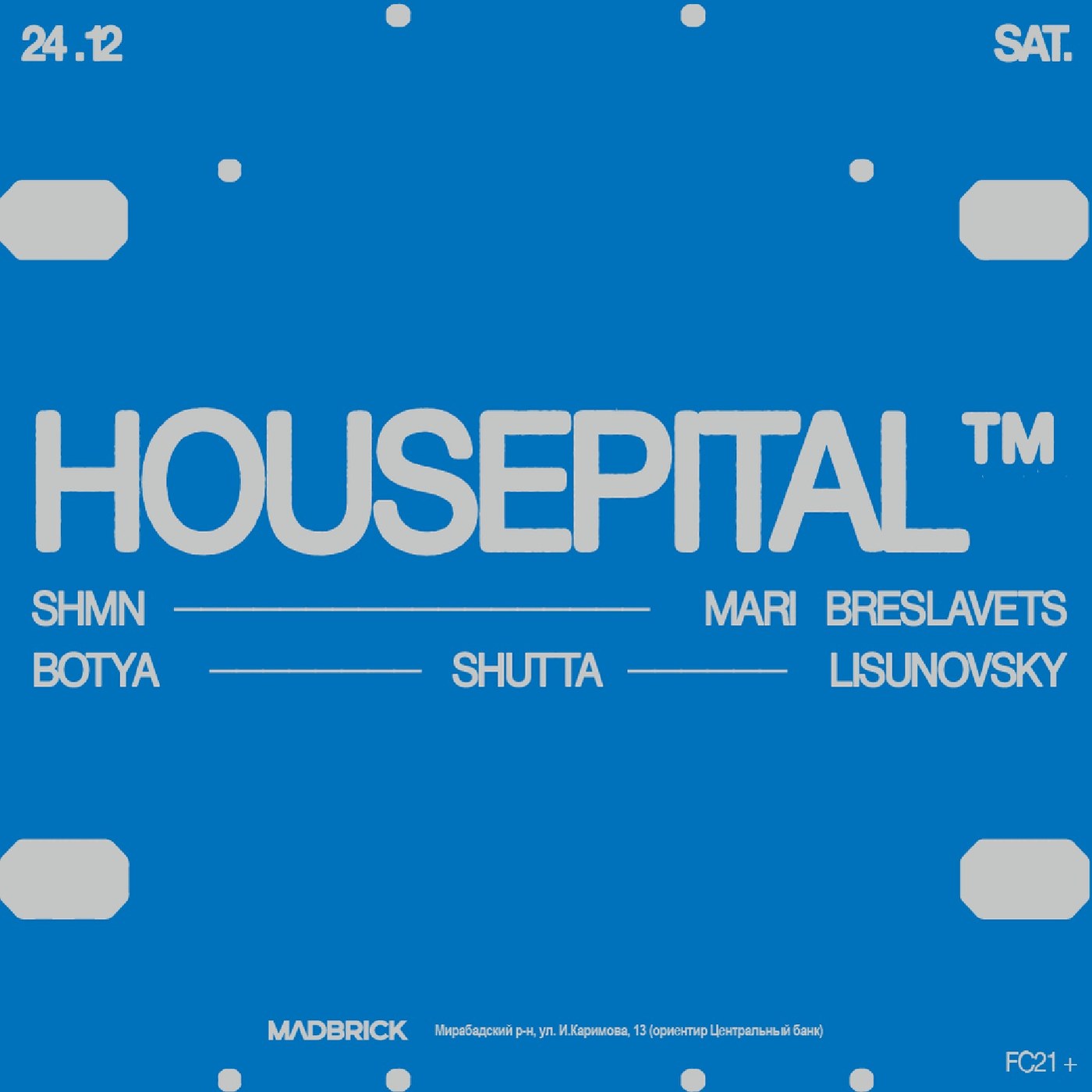
The Housepital™ project, brought to life by designer Dima Shiryaev, stands out as a comprehensive concept study drawing significant attention in the field of modern event branding and visual identity design. Combining typography, a color palette, and the integration of digital and physical media, this identity reflects the brand's position in the sector through an aesthetic language.
Standout Features of the Design
The Housepital™ visual identity merges a minimalist approach with dynamic design elements. Developed by Dima Shiryaev, the project rests on several fundamental building blocks:
- Typographic Choices: Custom font selections that support the event's modern and innovative character,
- Color Palette: Contrasting and harmonious tones that enhance brand memorability,
- Multi-Platform Adaptability: The design's seamless scalability across both printed materials and digital screens.
Sectoral Impacts
Comprehensive event identities of this nature play a critical role in shaping the attendee experience from the very first visual contact. A consistent brand language boosts the visibility of events across digital channels while strengthening the professional perception. Shiryaev’s approach serves as a strong reference for professionals interested in event design to understand current aesthetic trends.
Frequently Asked Questions
Which design disciplines does the Housepital™ visual identity project cover?
The project encompasses logo design, typography selection, the establishment of a corporate color palette, and the integrated design of digital and physical event materials.
How do event branding projects of this kind impact digital marketing?
A strong and consistent visual identity ensures that content shared on social media and websites increases brand awareness and leaves a more lasting impact on the target audience.
*This news article was prepared based on data published by Abduzeedo.
💬 Comments
No comments yet. Be the first!
You must be logged in to comment.
🔑 Log In