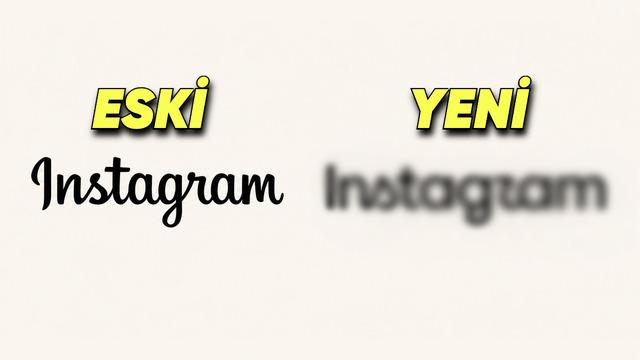
Instagram has updated its text-based logo, used for a decade, transitioning to a more modern font reminiscent of handwriting. Announced by Head of Adam Mosseri, this innovation leaves the iconic camera logo unchanged, while only sharpening and curving the lines of the wordmark.
Design Details of the New Wordmark
Instagram's renewed wordmark offers a structure with more pronounced curves and a handwritten aesthetic compared to its previous version. These design choices, particularly in the letters "s," "r," and "g," reflect the platform's effort to acquire a modern identity while maintaining its principle of simplicity.
User habits are also being put to the test with this change. While intense debates unfold on social media over the legibility and aesthetics of the new "r" and "s" letters, some users express that they find the new font unfamiliar. With this step, the company aims to create a visual language that goes beyond photo-sharing and supports the platform's versatile structure focused on video and text.
Reflections from the Design World and the Platform's Evolution
Having undergone a major visual transformation in 2016 by moving from the brown retro camera icon to a colorful gradient design, Instagram is now completing its minimal line with this wordmark. Such typography updates by social media giants stem from the need to increase brands' legibility in digital spaces and adapt to changing dynamics in screen resolutions.
Frequently Asked Questions
Was there any change to Instagram's camera icon?
No, the platform's iconic colorful camera logo has remained completely the same; the update only covers the text-based (word) logo.
Why is the typography of the new logo criticized among users?
The handwriting-inspired curves used in the "r" and "s" letters of the new design are criticized by some users on the grounds that they cause reading difficulties or an unusual visual perception.
*This news was prepared based on data published by Webtekno — Artificial Intelligence.
💬 Comments
No comments yet. Be the first!
You must be logged in to comment.
🔑 Log In