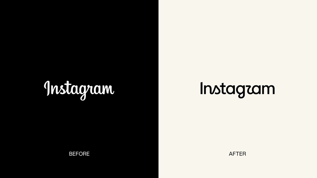
Instagram has announced a new wordmark design aimed at refreshing the platform's visual identity. This latest change made by the social media giant to its typography and logo details has sparked significant debate within the design community and among platform users; while some find the new look modern, others argue that it strays too far from traditional lines.
Key Details of the New Typography
This update to the platform's brand identity aims to improve readability, particularly on mobile screens and digital interfaces. Featuring simpler and sharper lines, the new wordmark creates a cohesive integration with Instagram's gradient color palette and minimalist design philosophy. However, typography enthusiasts and graphic designers are divided over whether the brand has compromised its previous characteristic stance.
Echoes in the Design World and User Reactions
Every minor change social media platforms make to their logos and typography is scrutinized by millions of users. From the moment it was announced, Instagram's new wordmark became a hot topic of debate on both X (formerly Twitter) and various design platforms. While some users find the change fresh and innovative, long-term loyal audiences state that they miss the nostalgic value of the former typography. Brands need to strike a delicate balance between user habits and modern design trends during such evolutionary processes.
What Does This Mean?
It is once again evident how delicate a balance user habits represent in digital product designs and brand identity updates. Micro-changes of this nature made by major platforms to their brand faces go beyond merely being an aesthetic preference; they also signal the brand's future positioning and visual language. For design professionals, this process serves as an important case study for observing how user reactions shape typographical choices.
Frequently Asked Questions
Is Instagram's new wordmark design being rolled out to all users simultaneously?
Meta typically rolls out such interface and brand identity changes to all platform users through a phased distribution process, including A/B testing and regional updates.
What are the primary technical criteria brands consider in such typography updates?
Key criteria include readability across different screen sizes (particularly on smartphones), alignment with minimalist interface trends, and scalability for spaces such as favicons or app icons.
*This news article was prepared based on data published by Creative Bloq.
💬 Comments
No comments yet. Be the first!
You must be logged in to comment.
🔑 Log In