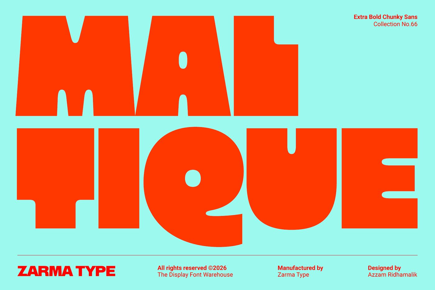
Maltique Extra Bold is a new chunky, bold sans-serif typeface designed to create a strong visual impact in digital and print projects. According to reports shared by Abduzeedo, this new font was developed specifically for use in modern headlines and poster designs where grabbing attention is key.
Key Design Features
Unlike traditional thin-lined fonts, Maltique Extra Bold boasts a remarkably robust and thick letter anatomy. This structure ensures high legibility and a commanding presence, particularly in interface designs and brand identity projects that embrace a minimalist or industrial aesthetic. The angular and geometric structure of the letters directly supports visual hierarchy on digital screens and large-scale posters.
Applications in Design
Such heavy sans-serif typefaces are frequently favored in digital advertising banners, social media visuals, website header sections, and packaging designs. Maltique Extra Bold offers designers flexibility, especially in projects aiming to maximize impact with minimal text.
Industry Implications
Typography trends in recent years indicate a growing interest in strong, characterful headline fonts alongside minimalist designs. Heavy-character typefaces like Maltique Extra Bold stand out as effective tools for immediately drawing users' eyes to the text in digital marketing materials and brand front-ends. Designers should take care to maintain a balance of legibility when integrating such fonts into their projects.
Frequently Asked Questions
In which types of projects do heavy typefaces like Maltique Extra Bold deliver the highest performance?
These bold and blocky typefaces yield the best results in short headlines, logos, posters, and digital ad banners where grabbing attention is crucial, rather than in text-heavy paragraphs.
What should I keep in mind when using this font in my projects?
Because extra bold fonts carry significant visual weight, maintaining a balanced ratio of negative space in the rest of the design and keeping a high contrast between the text color and the background will enhance legibility.
*This news report was prepared based on data published by Abduzeedo.
💬 Comments
No comments yet. Be the first!
You must be logged in to comment.
🔑 Log In