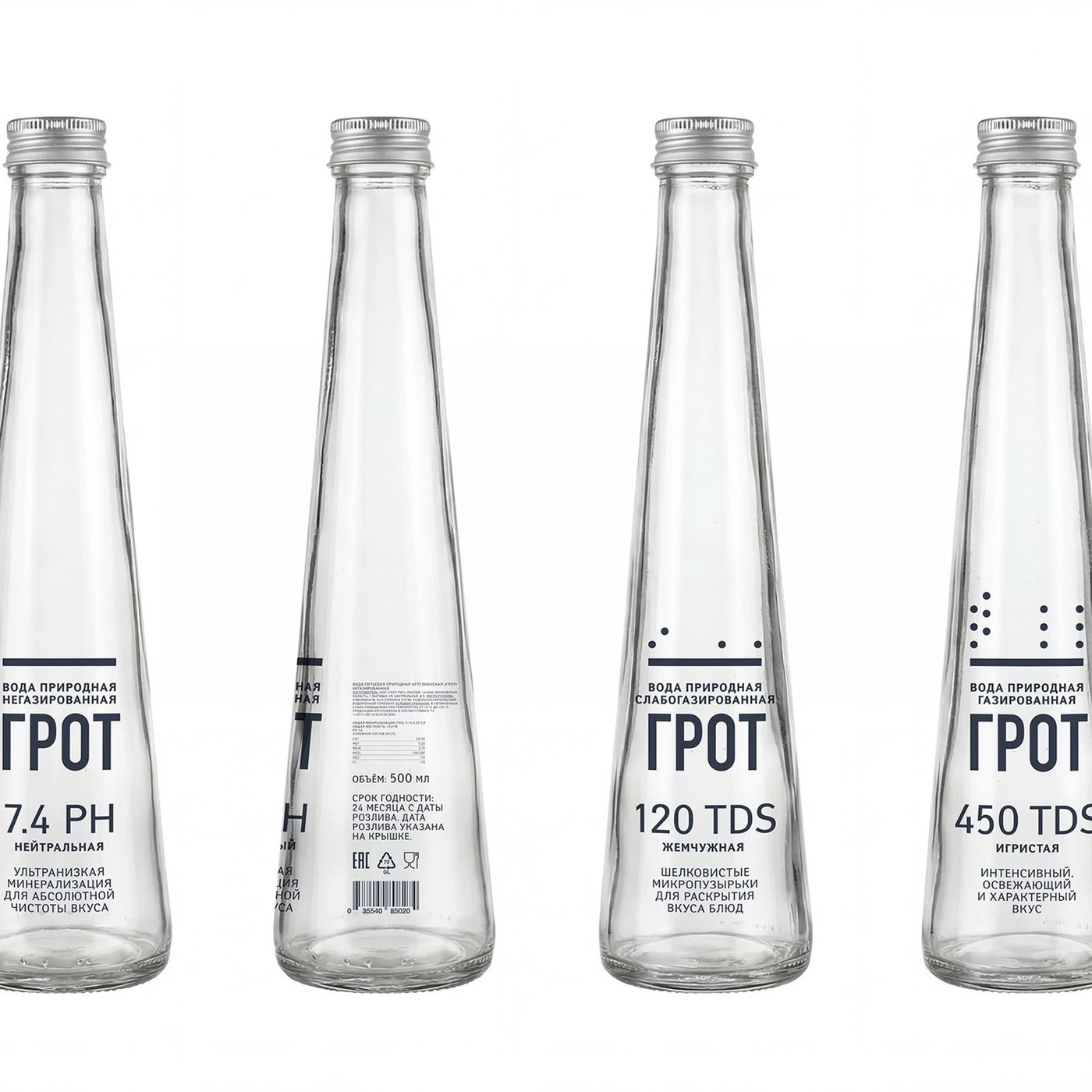
Created by designer Mariya Churilo, the GROT premium water packaging design presents a modern visual identity that combines minimalist aesthetics with functionality in the luxury beverage segment. Standing out with its bottle form and label typography, this concept strikes a well-balanced reflection of naturalness and premium perception in packaging design.
Design Details and Aesthetic Approach
Stepping outside the conventions frequently encountered in water packaging, the GROT project adopts a more refined touch. While the structural form of the bottle highlights the clarity and purity of the water, the matte or textured surfaces used promise consumers both a visual and tactile experience. As for the typographic choices, simple characters maintaining readability and a modern line are preferred, reinforcing the brand's premium stance.
Sectoral Reflections
In the food and beverage industry, packaging design stands out as one of the most critical factors determining a consumer's first impression on the shelf. Carefully crafted concepts like GROT demonstrate that brands offer not just a product, but a lifestyle and aesthetic value. Such works serve as an inspiring reference, especially for boutique water brands looking to differentiate themselves in a highly competitive market.
Frequently Asked Questions
What is the main feature that sets the GROT water packaging design apart from other concepts?
The design represents a simple yet effective aesthetic understanding in the luxury segment by prioritizing a minimalist form language and tactile surface details.
How do packaging designs of this style influence consumer preference?
They increase shelf appeal, elevate the perceived quality of the product, and contribute to building a premium image for the brand.
*This news article was prepared based on data published by Abduzeedo.
💬 Comments
No comments yet. Be the first!
You must be logged in to comment.
🔑 Log In