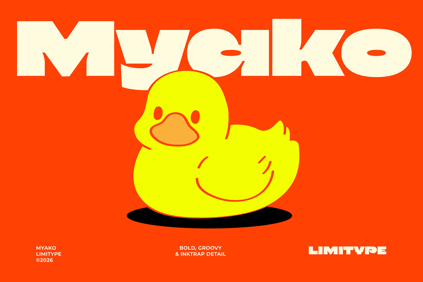
The Myako Display Font is a modern and striking display typeface that stands out with its heavy typographic structure and eye-catching ink trap details. According to design specimen data published by Abduzeedo, this font is turning heads in the typography world thanks to its strong visual presence, readability dynamics across digital and print media, and contemporary aesthetic.
Design Features and Highlights of the Myako Font
Myako features a heavy, solid character structure developed specifically for use in large-scale headings and brand identity designs. One of the design's most prominent elements is the ink trap details utilized at corner junctions. This technique ensures that the font maintains its character integrity even at the sharpest sizes in both digital displays and print, while lending it an industrial edge.
Its broad and bold letterforms offer a strong alternative for designers looking to instantly capture attention within a typographic hierarchy. Its minimalist yet characterful stance allows for flexible application across a wide range of uses, from poster designs to web interfaces.
Applications in Digital Design and Brand Identity
Bold display fonts are frequently favored in contemporary digital marketing and interface design to draw users' eyes directly to the main message. The Myako Display Font holds the potential to give brands a dynamic identity in modern website hero sections, social media campaigns, editorial headlines, and packaging designs. By utilizing such powerful typographic elements, designers can add depth even to minimalist layouts.
Industry Reflections and Tips for Designers
While powerful display fonts strengthen typographic hierarchy, they can reduce readability in text-heavy areas. Therefore, it is recommended to pair bold typefaces like Myako with simpler, neutral sans-serif or serif fonts for subtexts. Proper contrast and kerning adjustments maximize the performance of such heavy fonts on digital screens.
Frequently Asked Questions
Which design projects are best suited for the Myako Display Font?
Thanks to its bold structure and ink trap details, it is ideal for poster designs, attention-grabbing web headers, brand identity projects, and large-scale digital graphics.
What should designers keep in mind when choosing ink-trapped fonts like this?
While ink traps add a sharp character to a design from a distance, they can impact text legibility at very small sizes; therefore, the font's suitability for its intended use (large headings vs. body text) should be tested.
*This news article was prepared based on data published by Abduzeedo.
💬 Comments
No comments yet. Be the first!
You must be logged in to comment.
🔑 Log In