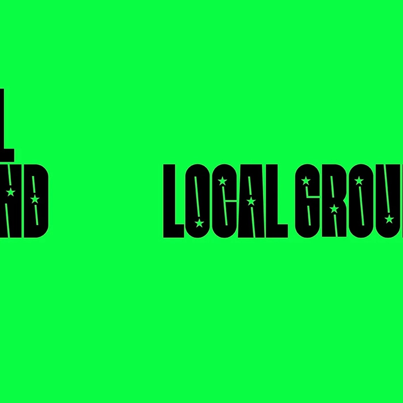
Designed by MAUM STUDIO, the visual identity of NAVER LOCAL GROUND presents a modern brand architecture that integrates digital and physical spaces. The design work brings together minimalist yet striking typography and color palette elements that strengthen the connection users establish with local venues and content.
Key Features of the Design
The project's visual infrastructure is built on a flexible grid system aimed at carrying the digital experience within NAVER’s ecosystem into the physical world. The dynamic logo placement used in the corporate identity work ensures high legibility and brand consistency across different screen sizes and printed materials. In this project, MAUM STUDIO has created a user-centric language by blending traditional local elements with contemporary digital aesthetics.
Industry Reflections
Comprehensive visual identity renewals of this kind stand out as part of a strategy by major tech platforms to extend user experience beyond mere interfaces into physical and geographical textures. For design professionals, this project offers a concrete example of how digital ecosystems can scalably combine brand identity with the perception of physical space.
Frequently Asked Questions
What is the primary objective of the visual language used by MAUM STUDIO in this project?
The design language aims to bridge the gap between NAVER’s digital services and the local user experience, creating a cohesive and flexible brand perception.
How do such corporate identity projects affect brand loyalty?
Delivering a consistent visual experience across multiple platforms strengthens users' visual connection with the brand and enhances the platform's reliability.
*This news report has been prepared based on data published by Abduzeedo.
💬 Comments
No comments yet. Be the first!
You must be logged in to comment.
🔑 Log In