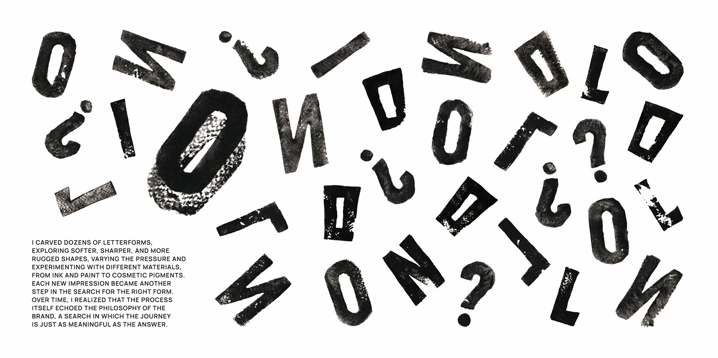
Developed by designer Veronika Kuziakina, the visual identity for the OLLIN wine brand is a minimalist design project that brings together modern typography, a simple color palette, and a sustainable packaging approach. The project moves away from traditional ornamentation in the wine sector, offering a contemporary and functional aesthetic that enhances shelf impact.
Key Features of the Design
In the visual language of the OLLIN project, highly legible typographic details and textured paper choices take center stage instead of complex illustrations. The clean layout on the bottle labels reinforces the brand's premium positioning while allowing for the use of sustainable materials during the production process. Meanwhile, the color palette consists of earth tones that reflect naturalness and the roots of winemaking.
Sectoral Impacts
In the food and beverage industry, minimalism stands out as one of the most important design trends, enabling consumers to focus instantly on the product. As seen in the OLLIN example, simple and clear label designs offer a more readable structure for e-commerce visuals on digital platforms while exhibiting a modern stance that sets them apart from competitors on physical shelves.
Frequently Asked Questions
What typographic choices stand out in the OLLIN wine identity design?
Instead of complex logotypes, the design favors modern, clean, and minimalist fonts that are easily legible even from a distance.
How do such minimalist wine packaging designs affect e-commerce visibility?
Products listed as small images on digital screens and mobile shopping apps are more easily noticed by users thanks to their simple and clear label designs.
*This news report has been prepared based on data published by Abduzeedo.
💬 Comments
No comments yet. Be the first!
You must be logged in to comment.
🔑 Log In