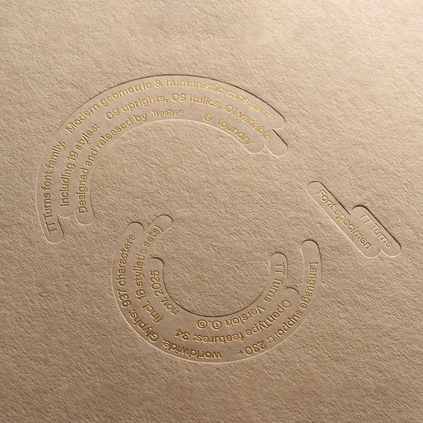
Designed by Pavel Emelyanov, the TT Turns font family and its dedicated typography showcase comprise a comprehensive typeface project offering flexible, aesthetic, and functional character sets for modern digital and print projects. This new typographic project aims to provide designers with a broad creative outlet in their design processes.
Design Details and Character Features
TT Turns combines geometric and human-centric lines, carefully crafted to strengthen typographic hierarchy and enhance readability. With its diverse weight and style options, the font family enables the creation of a consistent visual language across both corporate identity projects and digital interface designs. This work by Pavel Emelyanov offers a distinct scalability advantage, particularly in modern web projects and editorial designs.
Industry Implications
The industry-wide demand for high-quality and original font families is growing day by day. Brands and digital agencies seeking to move beyond standard typographies find opportunities to enrich user experiences and differentiate their brands through such custom-designed fonts. Modern character sets like TT Turns serve as an alternative tool for professionals looking to balance aesthetics and functionality in their design projects.
Frequently Asked Questions
What types of projects are best suited for the TT Turns font family?
Thanks to its wide range of weights and styles, it offers high compatibility for corporate identity design, web interfaces, mobile applications, and editorial projects.
How does this typographic work by Pavel Emelyanov affect project performance?
Its optimized character structures ensure sharp legibility on modern digital screens while strengthening visual hierarchy and enhancing overall design quality.
*This news article was prepared based on data published by Abduzeedo.
💬 Comments
No comments yet. Be the first!
You must be logged in to comment.
🔑 Log In