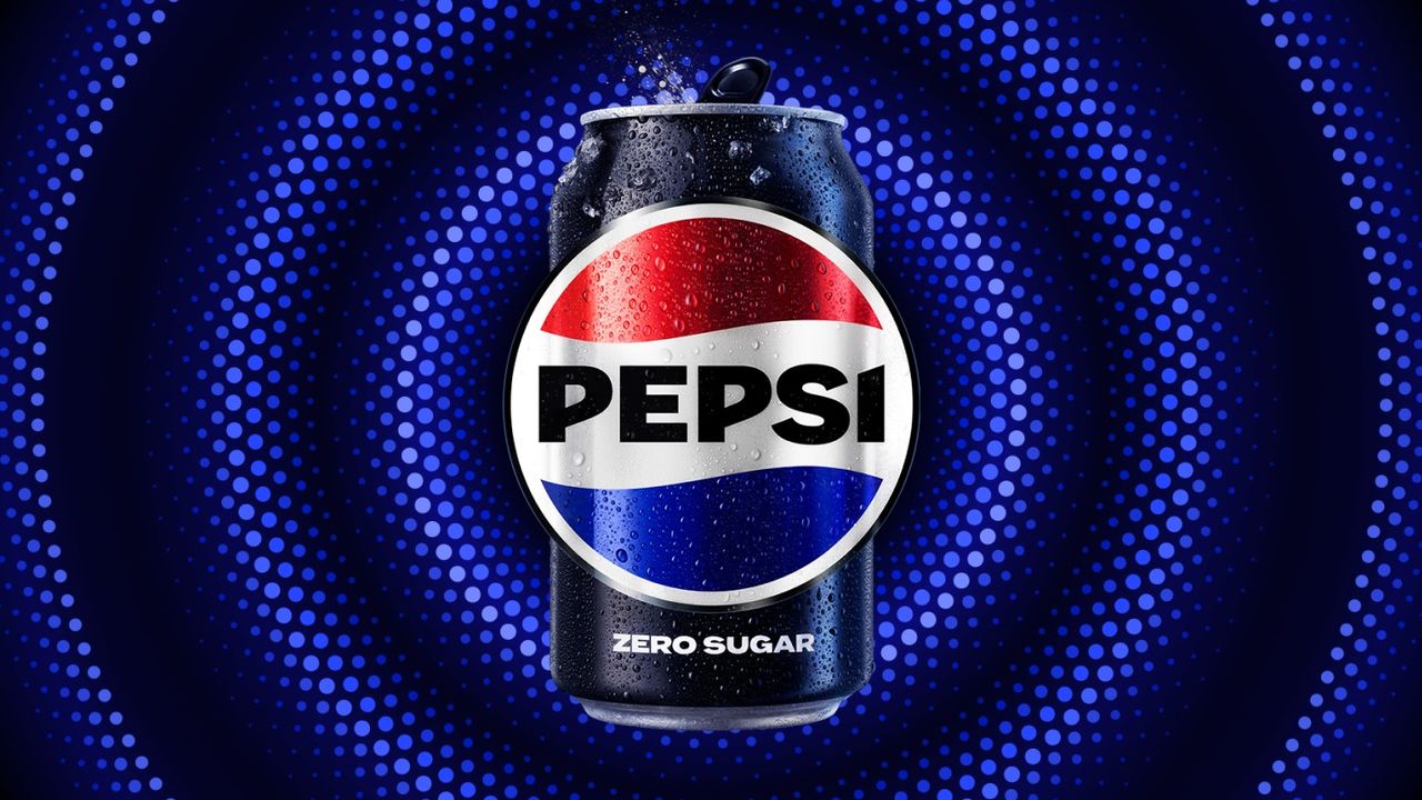
Pepsi has unveiled a parody brand identity and packaging concept that playfully targets the entrenched design language and iconic bottle shape of its longtime global rival, Coca-Cola. Framed around the motto "If it’s not broke, don’t fix it," this humorous campaign breathes new life into the historic rivalry between the two beverage giants.
Design Details and a Humorous Approach
In the parody concept, Pepsi blends Coca-Cola's century-old contour bottle lines and typographical elements with its own signature red, white, and blue color palette. Generating significant buzz in the design world, the move pokes fun at how seriously brands take their corporate identities while aiming to drive high brand awareness and entertainment value among consumers. Serving as an ironic stance against traditional rebranding trends, the project once again highlights the power of humor in industrial design.
Industry Reflections and Strategic Takeaways
Parody campaigns of this scale enable corporate giants to communicate with consumers more directly and informally, emerging as an effective marketing tool to boost organic social media engagement. For design and digital marketing professionals, such playful projects prove that stepping outside strict corporate guidelines allows for creative risks that can generate a powerful viral impact on audiences.
Frequently Asked Questions
Has Pepsi launched this parody design permanently?
No, the project is not a permanent product or packaging overhaul; rather, it is a humorous nod to the design heritage and classic lines of its rival brand.
What marketing advantages do such parody rebranding moves offer brands?
By showing that they do not take themselves too seriously, brands can boost consumer sympathy while gaining high organic visibility and engagement across social media platforms.
*This report is based on data originally published by Creative Bloq.
💬 Comments
No comments yet. Be the first!
You must be logged in to comment.
🔑 Log In