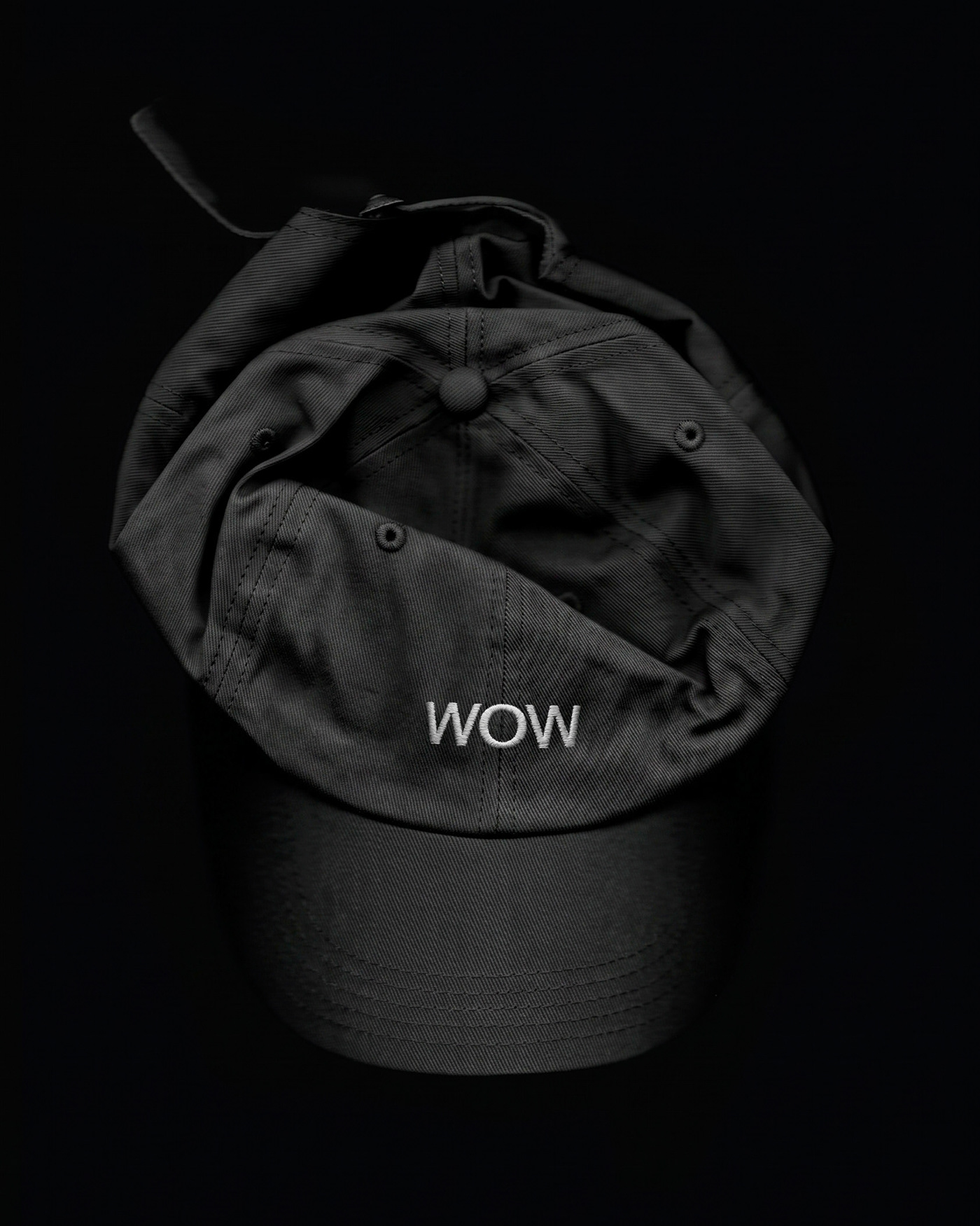
The WOW visual identity project, designed by Plural Branding Studio, stands out as a comprehensive branding initiative that brings together modern design dynamics and aesthetic approaches. According to data featured on Abduzeedo, the project incorporates original visual elements that draw attention through the integration of typography, a color palette, and brand language.
Key Highlights of the Design
The visual language employed in the work consists of minimalist and dynamic elements aimed at strengthening the brand's communication with its target audience. Plural Branding Studio has strategically positioned typographical details and color transitions within the project to establish a consistent corporate identity. This approach offers scalable usability across both digital and print media.
Industry Reflections
Comprehensive visual identity projects of this nature provide concrete examples of how modern trends in the design world are adopted by brands. The way agencies support brand storytelling with visual assets highlights the importance of combining aesthetics and functionality, particularly within digital marketing and user experience (UX) processes.
Frequently Asked Questions
Which agency designed the WOW visual identity project?
The project was designed by Plural Branding Studio.
What is the primary advantage of such corporate identity projects in digital marketing?
A consistent and scalable visual language increases brand memorability across digital channels and print materials, enabling a strong connection with the target audience.
*This news article has been prepared based on data published by Abduzeedo.
💬 Comments
No comments yet. Be the first!
You must be logged in to comment.
🔑 Log In