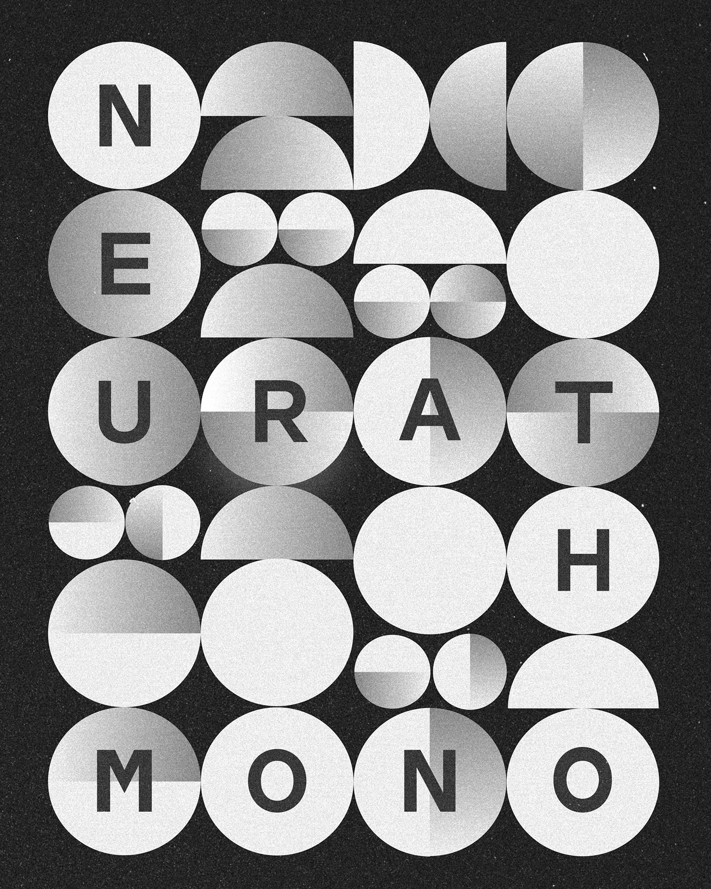
Developed by designer René Bieder, Neurath Mono offers a fresh typographic alternative for both digital and print projects with its monospaced structure and sharp geometric forms. Prioritizing minimalist aesthetics and readability, this new typeface family promises a robust visual foundation, particularly for modern interface design and code editors.
Key Features of Neurath Mono
Blending the monospaced layout of traditional typewriter fonts with modern geometric lines, Neurath Mono bridges functionality with aesthetics in the design world. The equal width of the characters eliminates alignment flaws, especially in digital interfaces, code blocks, and data-dense publications. Bearing René Bieder's signature, this family provides designers with versatile usage options through various weight selections.
Applications in Design and Digital Marketing
In recent years, monospaced typographies have been increasingly favored not only in software development environments but also in modern web design, brand identities, and editorial projects. Neurath Mono stands out as an ideal tool for creating a strong character in tech-focused websites, minimalist logos, and industrial design projects. Its highly legible structure directly supports the user experience on digital screens.
Industry Implications
Such innovations in typeface design directly influence the visual language of digital products. Professionals specializing in user interface (UI) and user experience (UX) design, in particular, tend to opt for such high-quality geometric font families when seeking a fresh perspective in their projects. Tools like Neurath Mono enable designers to establish typographic hierarchy more consistently.
Frequently Asked Questions
In which projects should monospaced fonts like Neurath Mono be preferred?
Such fonts are generally preferred in code editors, data-driven interfaces, minimalist web designs, and modern brand identity projects to enhance readability and ensure vertical alignment.
What is the impact of a typeface family on digital marketing projects?
Selecting a distinct and high-quality typography strengthens a brand's visual consistency across digital channels, increases users' text scanning speed, and positively impacts the overall user experience.
*This news article was prepared based on data published by Abduzeedo.
💬 Comments
No comments yet. Be the first!
You must be logged in to comment.
🔑 Log In