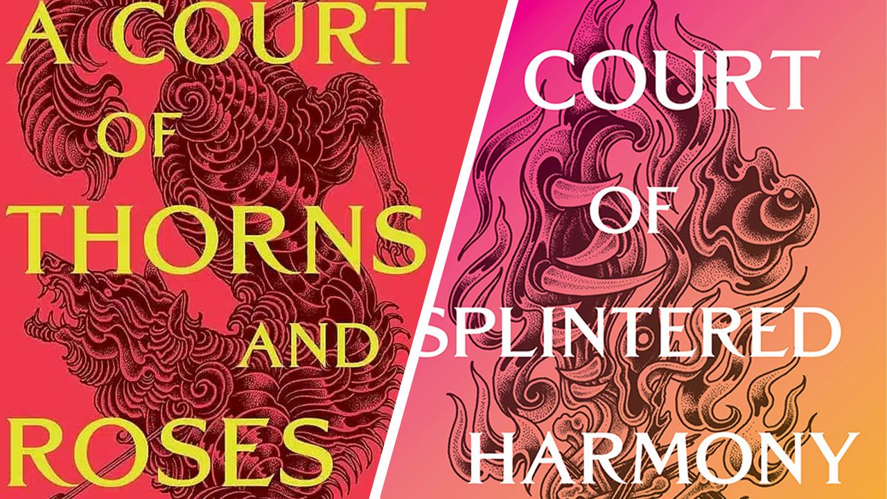
The new gradient-designed book covers announced for author Sarah J. Maas's popular "A Court of Thorns and Roses" (ACOTAR) series have sparked widespread backlash in the digital design and publishing worlds for evoking a distinctly 2016 aesthetic. Rapidly circulating across social media and design platforms, the new covers have reignited the debate over the fine line between minimalism and digital illustration trends.
Visual Language and Features of the New Cover Designs
The newly announced editions stand out with their flat, harsh color-gradient backgrounds. Reminiscent of the web design and digital illustration movements popular in the mid-2010s, this style offers a concept distinct from today's more textured, illustrative, and organic cover trends. Causing a divide among the fan base, this aesthetic choice nods more toward modern graphic design practices than classical fantasy literature covers.
Industry Reflections and the Response from the Design World
Such nostalgic or period-specific design choices demonstrate how brands in the publishing industry can reinterpret past popular trends while refreshing their visual identities. Although some readers find the new design modern, a segment argues that it falls short of reflecting the series' rich fantasy world. This situation serves as a concrete example of how quickly aesthetic expectations can shift in popular culture products.
Frequently Asked Questions
Do the new ACOTAR covers apply to all books in the series or just a specific edition?
The newly unveiled gradient designs cover specially renewed, newly printed editions of the popular series.
Why does the design world associate these kinds of gradient transitions with 2016 trends?
The year 2016 is known as one of the periods when soft color transitions (duotones and gradients) were most heavily used in digital interfaces and graphic design; the new covers directly reflect this color palette and transition technique.
*This report is based on data published by Creative Bloq.
💬 Comments
No comments yet. Be the first!
You must be logged in to comment.
🔑 Log In