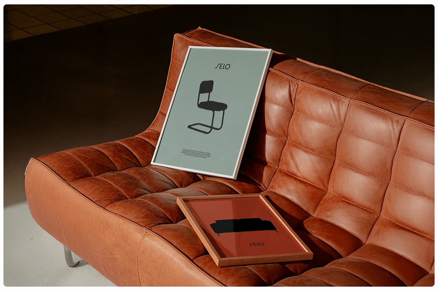
Modern furniture brand SELO has announced its striking new brand identity and comprehensive visual system in the design world. According to reports from Abduzeedo, this new visual language reflects the brand's contemporary aesthetic and industrial lines through a minimalist approach.
New Visual System and Design Language
SELO's revamped brand identity involves the redesign of its typography, color palette, and digital assets to stand out in the competitive modern furniture sector. During the design process, the clean lines and material quality inherent in the furniture were directly translated into graphic elements, aiming for a cohesive brand experience. Minimalist typographical choices and functional grid structures ensure that the brand maintains a consistent stance across both print materials and digital platforms.
Sectoral Reflections and Design Trends
In the furniture and interior architecture sectors, brands must stand out not only through product quality but also via visual consistency in the digital realm. SELO's adoption of this simple yet sophisticated visual system offers a timely example of how industrial design can be blended with digital marketing communications. For brands of a similar scale, such comprehensive identity overhauls play a critical role in increasing perceived value in the eyes of the target audience.
Frequently Asked Questions
Which design trends form the basis of SELO's new identity?
The new identity is built upon minimalist typography, functional grid structures, and a subdued color palette that reflects the industrial lines of the products.
How does this type of visual system renewal benefit furniture brands in digital marketing?
By delivering a consistent aesthetic across print and digital media, it enhances brand recognition and fosters a premium perception among the target audience.
*This news report has been prepared based on data published by Abduzeedo.
💬 Comments
No comments yet. Be the first!
You must be logged in to comment.
🔑 Log In