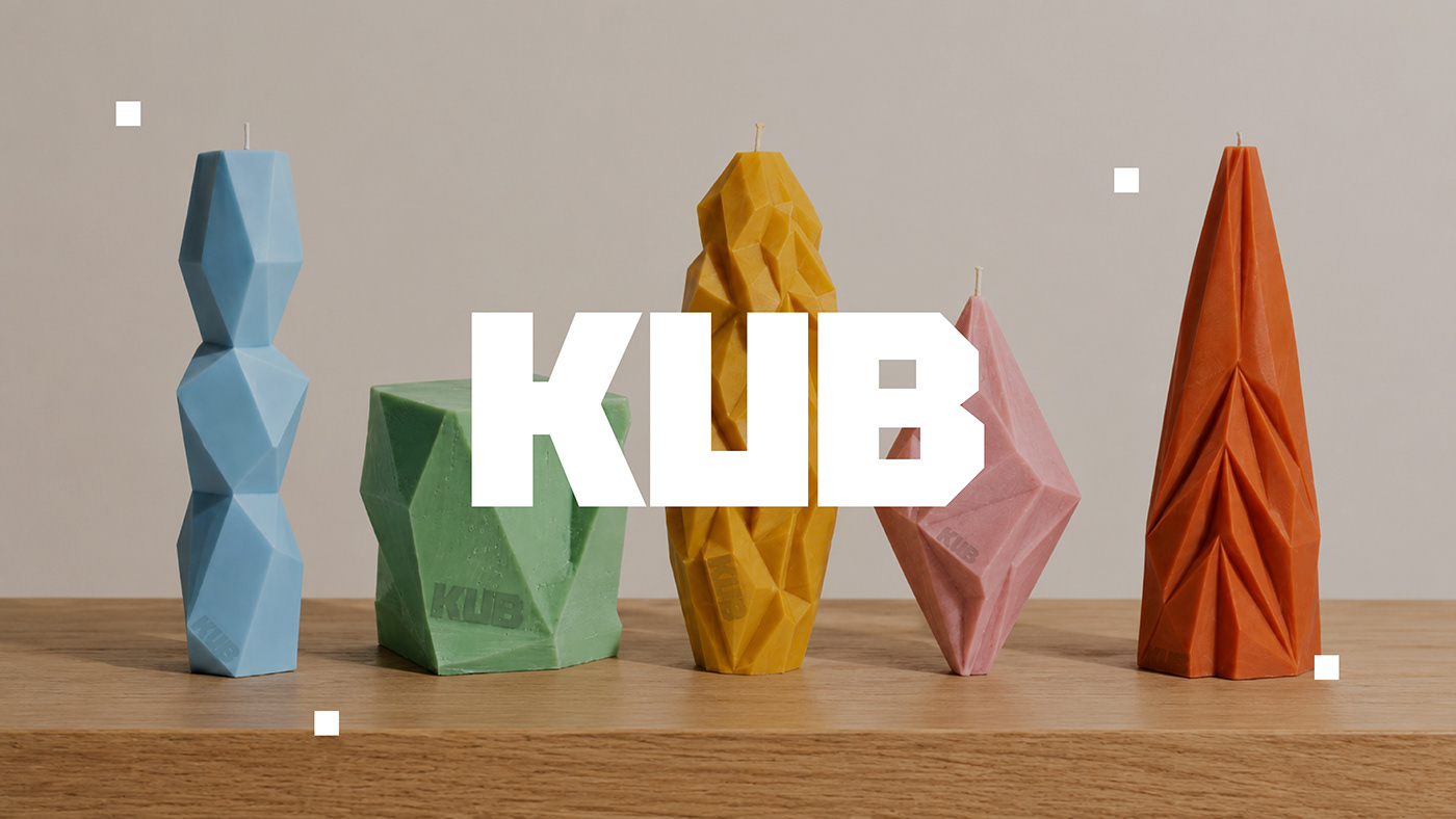
Created by designer Taisia Vystavkina, the brand identity for KUB Candle presents a visual concept that merges modern aesthetics with a minimalist approach. Through carefully selected typography, packaging, and color palettes, this bespoke design project aims to establish a simple yet powerful brand stance within the candle sector.
Key Design Features
The visual language of KUB Candle embraces a clutter-free philosophy focused on form and function. While the typographical choices reinforce the brand's modern profile, their placement on the packaging enhances the product's shelf appeal. In the color palette, calm and serene tones harmonizing with the natural composition of the candles are preferred, creating a cohesive brand experience.
Industry Implications
Viewed from the perspective of visual arts and digital marketing, minimalist identity designs in niche product categories strengthen consumer perception of trust and quality. As seen in the case of KUB, simplicity in details and a consistent visual language enable brands to establish a more aesthetic and memorable presence across digital channels, particularly social media platforms.
Frequently Asked Questions
What core visual elements stand out in the KUB Candle brand identity design?
Minimalist typography, calm color palettes, and the textural harmony of the packaging constitute the brand's core visual character.
How do minimalist brand identities of this style benefit brands in digital marketing?
Thanks to their simplicity, they offer a clean visual language that quickly captures attention in social media feeds and digital catalogs, thereby reinforcing brand perception.
*This news article was prepared based on data published by Abduzeedo.
💬 Comments
No comments yet. Be the first!
You must be logged in to comment.
🔑 Log In