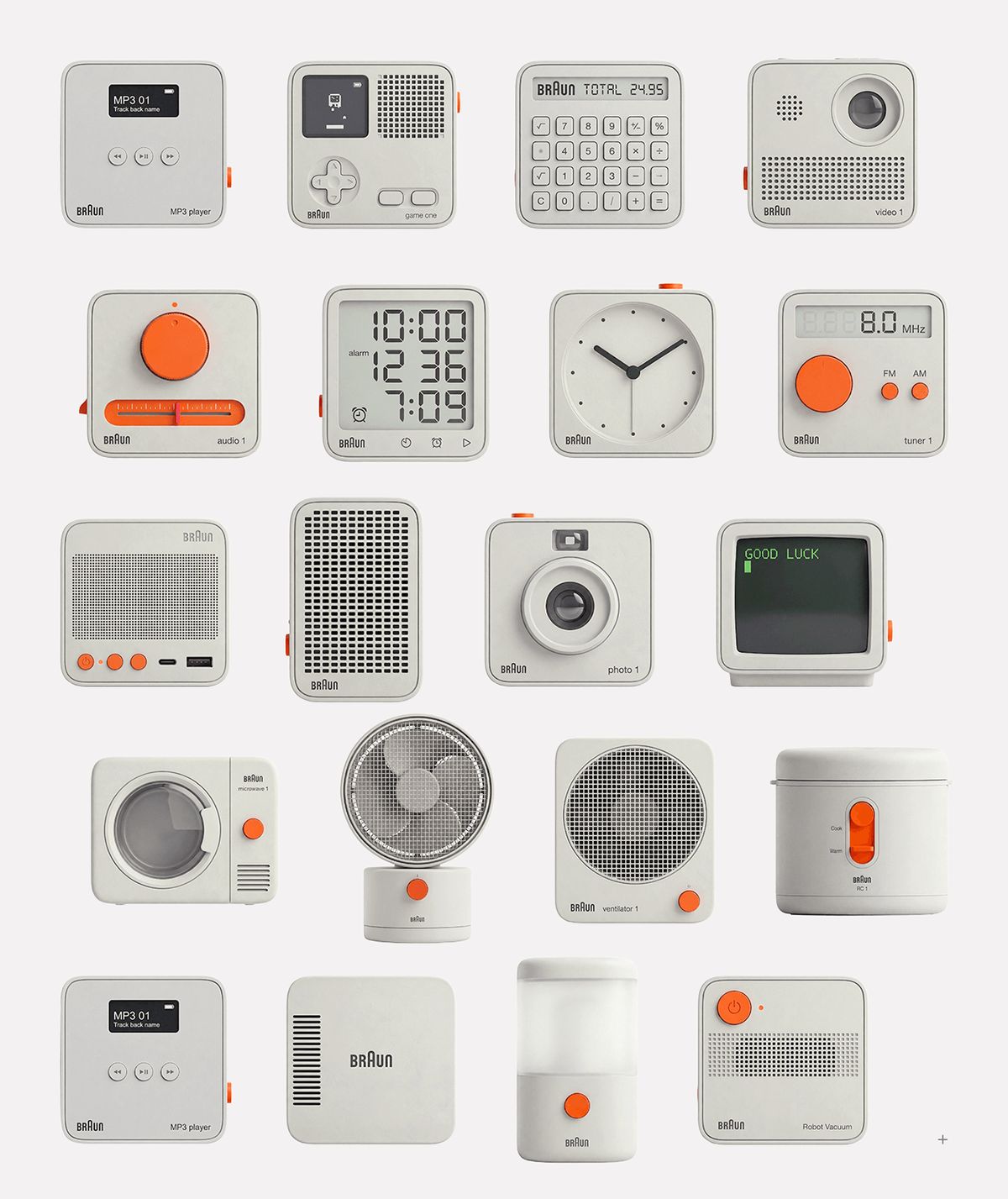
Designer Lu Yan has unveiled a new system icon design project inspired by the "good design" philosophy of industrial design legend Dieter Rams. Bringing Rams' focus on functionality, simplicity, and a user-centric approach to digital interfaces, the work once again highlights the importance of minimalist and clear lines in modern iconography.
Digital Reflections of the Dieter Rams Philosophy
Dieter Rams—who set the standards of the industrial design world with his iconic products for Braun—based his work on the principle of "Less, but better," which forms the core backbone of Lu Yan's new icon set. The project eliminates the visual clutter and unnecessary details frequently encountered in digital systems. Each icon aims to communicate its represented function to the user in the simplest and most comprehensible visual language.
Functionality and Simplicity in Interface Design
This conceptual study offers a fresh perspective, particularly for professionals working in user experience (UX) and user interface (UI) design. In today's web and mobile ecosystems, where digital products tend to grow increasingly complex, this Rams-inspired minimalist approach reduces cognitive load, allowing users to navigate interfaces more intuitively and quickly. The icons' flawless adherence to grid systems and geometric balance demonstrate how aesthetics and functionality can be balanced in digital environments.
Industry Implications
The adaptation of industrial design principles to digital interfaces serves as a concrete example of the interdisciplinary interaction that has long been debated among current UI/UX trends. Such conceptual works not only offer an aesthetic direction for digital product teams, but also function as a practical source of inspiration for how icon sets can improve accessibility and universal perception standards.
Frequently Asked Questions
Which design principles are the basis of the icon set designed by Lu Yan?
The project is based on adapting Dieter Rams' principles of functionality, honesty, comprehensibility, and "less, but better" simplicity—championed in industrial design—to digital interfaces.
How do conceptual icon designs of this style contribute to UI/UX processes?
By reducing visual noise, they help users grasp interfaces more quickly and facilitate the creation of a universal visual language in digital products.
*This news report is based on data published by Abduzeedo.
💬 Comments
No comments yet. Be the first!
You must be logged in to comment.
🔑 Log In