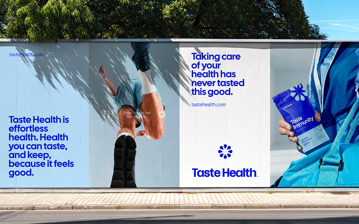
Taste Health introduces a minimalist approach that combines aesthetics and functionality in the functional food market with its new brand identity and packaging design tailored for the nutrition and wellness sector. The project stands out with its clean typography, natural color palettes, and sustainable packaging materials aimed at boosting consumer trust.
Design Philosophy and Visual Language
Taste Health’s identity work is built on making complex nutritional values and health claims easier to understand both on shelves and across digital channels. To evoke simultaneous perceptions of "naturalness" and "scientific credibility" upon the consumer's first contact with the product, the design team emphasized the following elements:
- Clean Typography: Modern sans-serif fonts that ensure product ingredients and benefits are instantly readable.
- Natural Color Palette: Earth tones, soft greens, and neutral backgrounds that inspire trust in the health and nutrition category.
- Functional Packaging: Minimalist box and label layouts made from sustainable materials that improve the user experience.
Digital Marketing and Shelf Positioning
In today's competitive wellness market, packaging serves not only on physical shelves but also as a marketing vehicle across visually driven digital platforms like Instagram and TikTok. Keeping these dynamics in mind, Taste Health has been optimized to offer high readability on e-commerce product listing pages (PLPs) while delivering an "aesthetic" look on social media. This strategy once again proves how critical packaging design is as an SEO and marketing component for brands looking to stand out in digital storefronts.
Takeaways for the Design World
For brands operating in the health and nutrition sector, visual identity is much more than just a logo design—it is the initial bond of trust formed with the consumer. The Taste Health case clearly demonstrates how brands that blend complex product ingredients with minimalism can gain a competitive edge on both physical retail shelves and digital search and discovery algorithms.
Frequently Asked Questions
What strategic priorities were considered in Taste Health's packaging design?
The design prioritized the rapid comprehension of complex nutritional information by consumers, high visual compatibility across digital channels, and the use of sustainable materials.
How do minimalist brand identities of this kind impact e-commerce sales?
Minimalist and clear typography allows products to be quickly noticed on digital listing pages (even on mobile screens), directly increasing click-through rates and consumer trust.
*This news article was prepared based on data published by Abduzeedo.
💬 Comments
No comments yet. Be the first!
You must be logged in to comment.
🔑 Log In