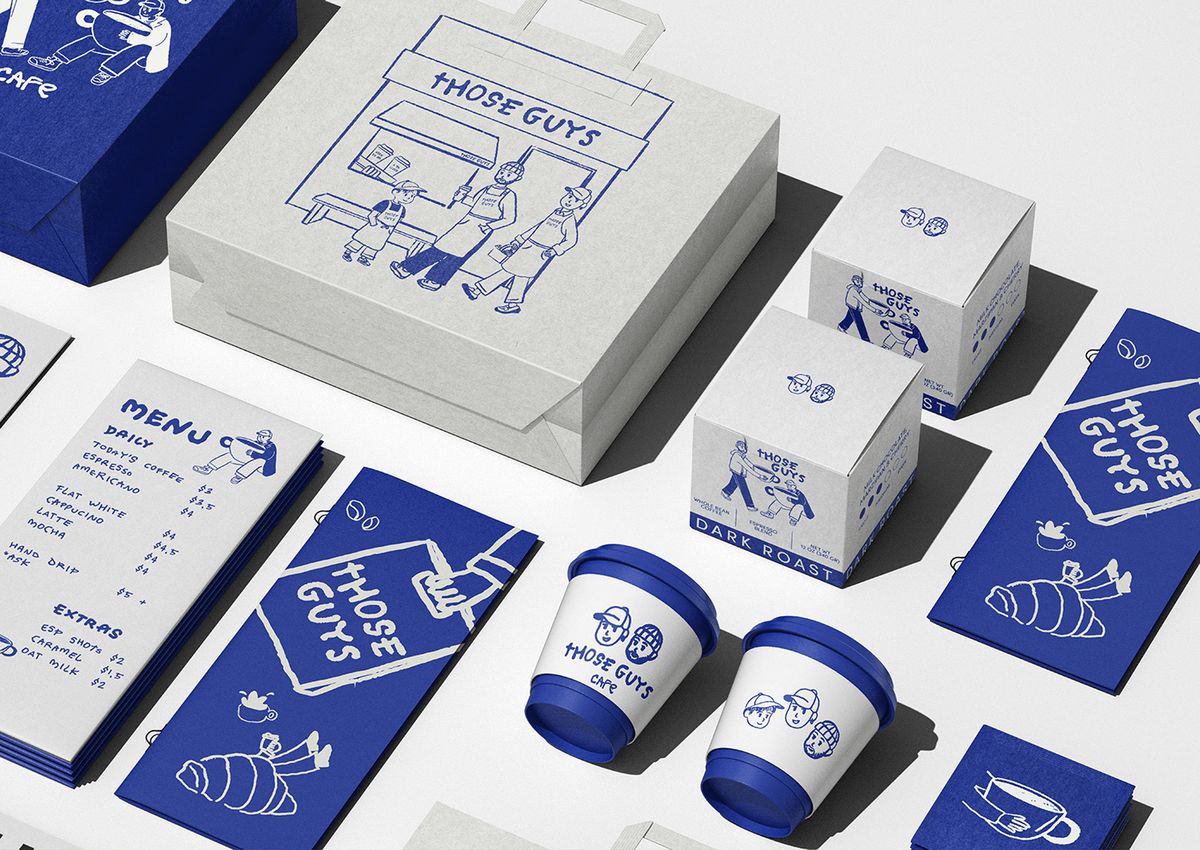
Designed by the ARTSBY EMDE studio for Those Guys Cafe, the new coffee brand identity breaks away from traditional cafe aesthetics, offering bold typography, striking color contrasts, and a minimalist yet memorable visual language. This comprehensive design project delivers a modern and assertive stance within cafe culture, extending from packaging to digital touchpoints.
Bold Design Elements and Visual Language
The strong typographic choices utilized throughout the design process bring the brand's character to the forefront, while the selected color palette evokes a sense of modern industrialism and reflects the cafe's energetic atmosphere. The harmony across packaging design, cups, and in-house materials ensures a cohesive brand experience.
Industry Implications and Differentiation in Design
In today's coffee market, having a strong visual identity is critically important for brands to stand out from their competitors. As seen in the case of Those Guys Cafe, adopting a bold and memorable design language—in place of traditional coffee tones—paves the way for building a faster and more effective connection with the target audience. This approach functions not merely as an aesthetic touch, but also as a powerful marketing tool.
Frequently Asked Questions
How do bold brand identities of this nature impact the marketing success of small-scale cafes?
A strong and distinctive visual identity enables a business to stand out more quickly on social media within a crowded coffee market and ensures memorability at first impression.
Beyond aesthetics, which practical design elements stand out in the Those Guys Cafe project?
Alongside the aesthetic appeal, the project prioritizes the adaptability of packaging across different product types, highly legible typography, and brand consistency.
*This news article was prepared based on data published by Abduzeedo.
💬 Comments
No comments yet. Be the first!
You must be logged in to comment.
🔑 Log In