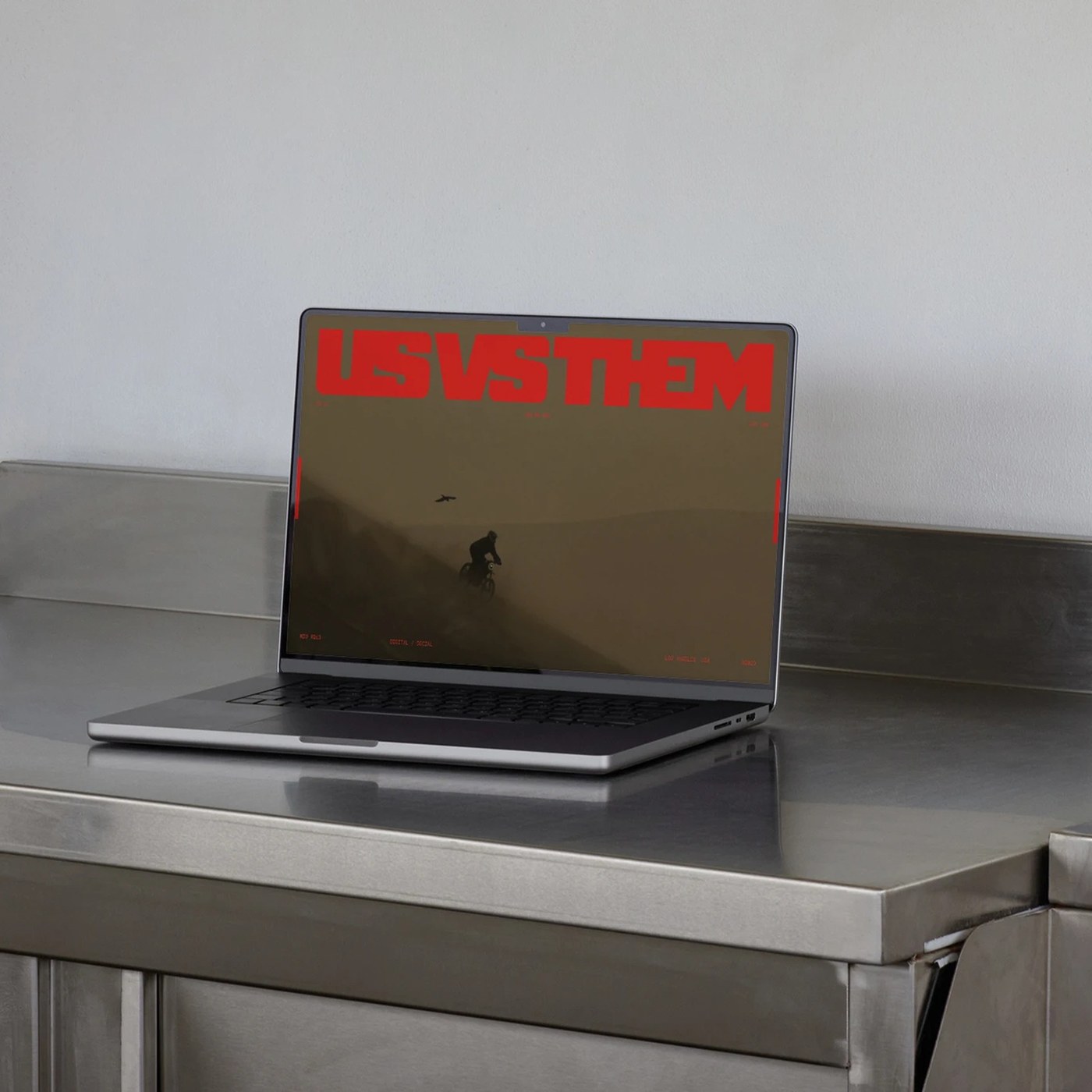
The new visual identity project developed by Monga Design for the Us Vs Them brand stands out with its grid layout, strong typography choices, and structured design language. Combining modern design trends with a functional approach, this work aims to enhance the brand's consistency across both digital and print media.
Standout Features of the Design and Grid Architecture
At the center of the project is a flexible grid system that carries content and visual elements in a seamless balance. Through this layout, the Monga Design team has established an infrastructure that preserves corporate integrity even across different media formats.
Alongside the grid structure, the typography choices reinforce the brand's rebellious and assertive stance. The scalability and readability of the typography align fully with modern digital marketing standards that prioritize user experience.
Industry Reflections
Such comprehensive visual identity overhauls play a critical role in strengthening the visual connection brands build with their target audiences. A well-crafted grid layout and typographic harmony do not merely offer an aesthetic layer; they also indirectly improve content readability and scannability across digital platforms (in terms of SEO and user experience). For designers, projects of this nature serve as great references demonstrating the direct contribution of systematic work to brand consistency.
Frequently Asked Questions
Why is a grid layout critically important in such visual identity projects?
The grid layout eliminates chaos in the design process by ensuring a consistent, readable, and professional arrangement across different screen sizes and print media.
What should brands consider regarding typography selection when revamping their visual identities?
In addition to reflecting the brand's character, readability performance on digital screens and the flexibility of different font weights should be prioritized when selecting typography.
*This news is based on information prepared utilizing data published by Abduzeedo.
💬 Comments
No comments yet. Be the first!
You must be logged in to comment.
🔑 Log In