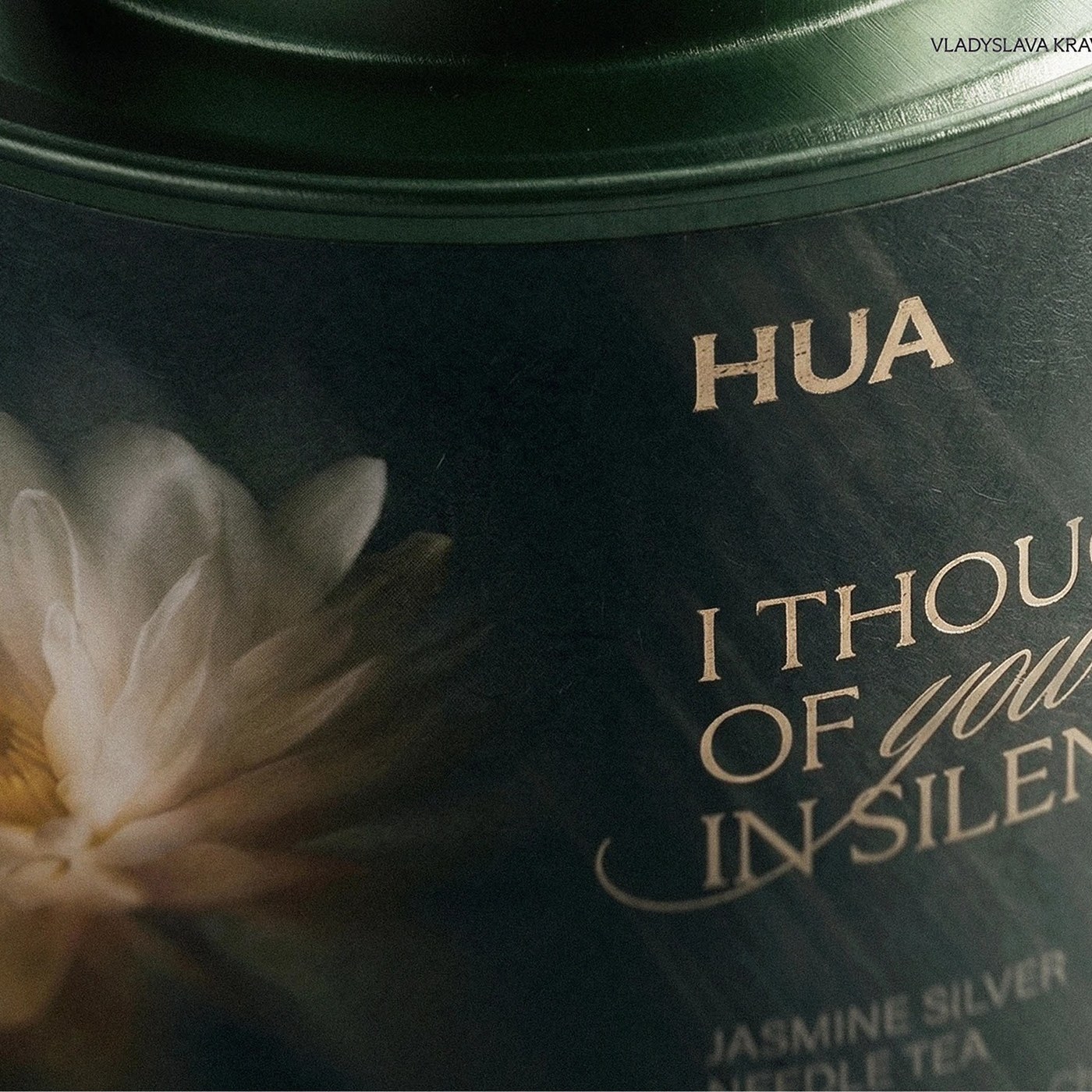
Designed by Vladyslava Kravchenko, the HUA Tea packaging is a modern project that highlights a minimalist aesthetic and a natural color palette. Combining the calming and elegant nature of tea culture with visual elements, the project successfully blends both functionality and aesthetic details in packaging design.
Key Features of the Design
At first glance, the HUA Tea packaging project draws attention with its simplicity and sophisticated details. While the typography choices emphasize the origin and naturalness of the tea, the textural details on the packaging surface elevate the user experience. As for the color selection, overly bright tones have been avoided in favor of the tranquil shades of earth and leaves, which stands out as one of the fundamental elements strengthening the brand's premium perception.
Industry Implications
In contemporary packaging design trends, sustainability and a minimalist approach take priority. Works like the HUA Tea project demonstrate that, in order to stand out on shelves, brands are turning toward simple, narrative-driven designs with a high tactile feel rather than complex graphics. Such approaches play a critical role in establishing a sense of trust and quality upon the consumer's first contact.
Frequently Asked Questions
Which visual elements stand out in the HUA Tea packaging design?
Minimalist lines, natural color palettes, and simple typography reflecting the origin of the tea come to the forefront in the design.
What kind of advantages do such minimalist packagings provide for brands?
While creating a premium and reliable perception among consumers, they allow brands to display a clear stance away from clutter on the shelves.
*This news article was prepared based on data published by Abduzeedo.
💬 Comments
No comments yet. Be the first!
You must be logged in to comment.
🔑 Log In