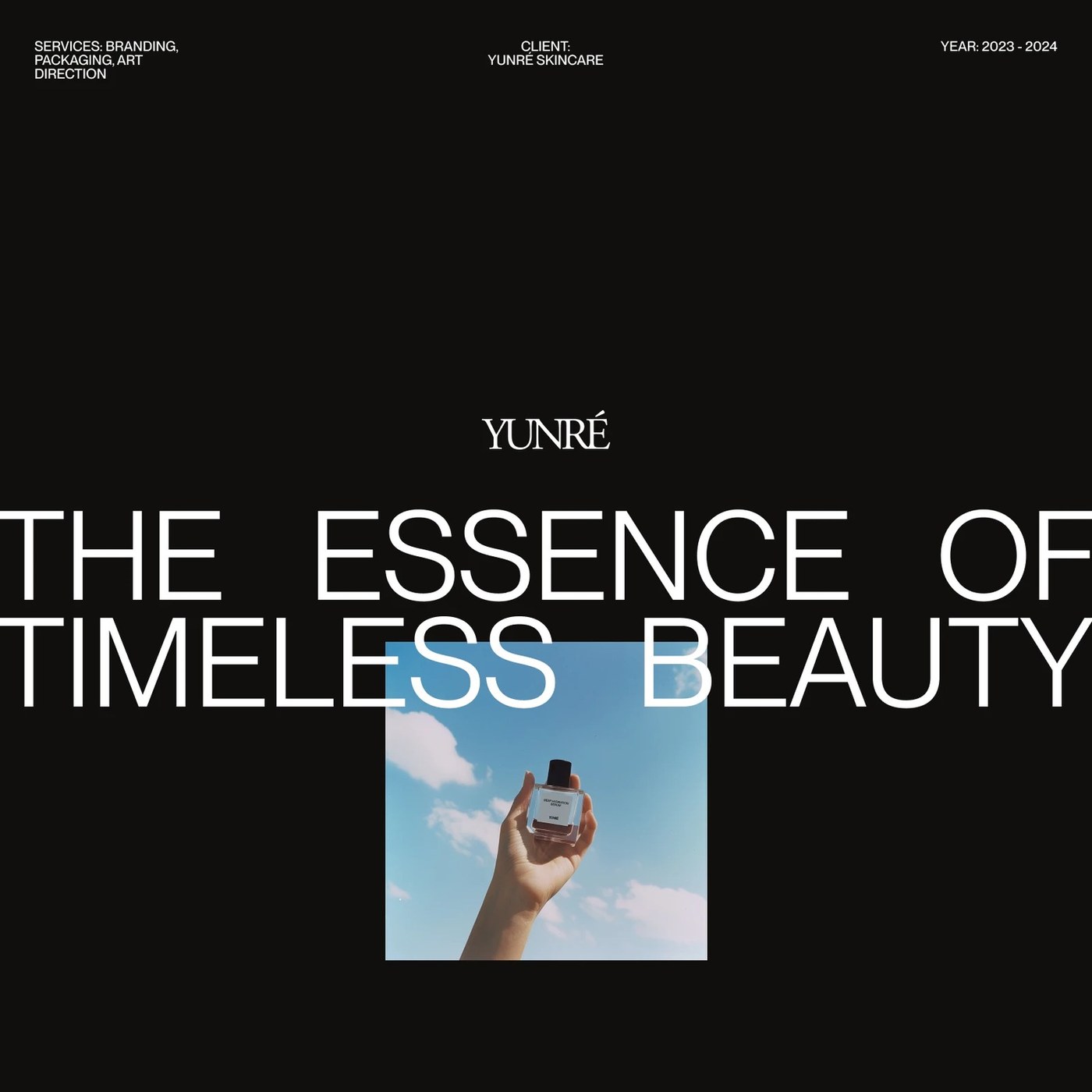
The corporate identity and packaging project designed by Owlsome Studio for the Yunré skincare brand offers a modern approach that highlights simplicity and sophisticated aesthetics in the natural cosmetics market. The project successfully translates the brand’s philosophy of purity in skincare into a visual language.
Highlights of the Design
The visual identity of the Yunré brand is built upon a clutter-free, airy, and clean design language. Owlsome Studio opted for calming tones symbolizing nature in the packaging design and brand color palette, aiming to evoke a sense of trust and tranquility in consumers. For the typography, modern and timeless characters with high readability were utilized.
Sectoral Reflections and Aesthetic Approach
In the cosmetics and skincare industry, packaging design directly influences the initial connection a consumer forms with a product. As seen in the case of Yunré, minimalist packaging and sustainable design choices align perfectly with contemporary consumer trends. This approach not only enables brands to stand out visually on crowded shelves and digital platforms, but also delivers a silent yet powerful message regarding product quality.
Frequently Asked Questions
Which agency is responsible for the identity design of the Yunré skincare brand?
The project was brought to life by Owlsome Studio, known for its creative design and corporate identity work.
What kind of advantages do such minimalist packaging designs provide for cosmetics brands?
Minimalist designs reinforce a brand's premium perception while instilling trust in the consumer and allowing products to appear more aesthetic on digital platforms.
*This news article was prepared based on data published by Abduzeedo.
💬 Comments
No comments yet. Be the first!
You must be logged in to comment.
🔑 Log In