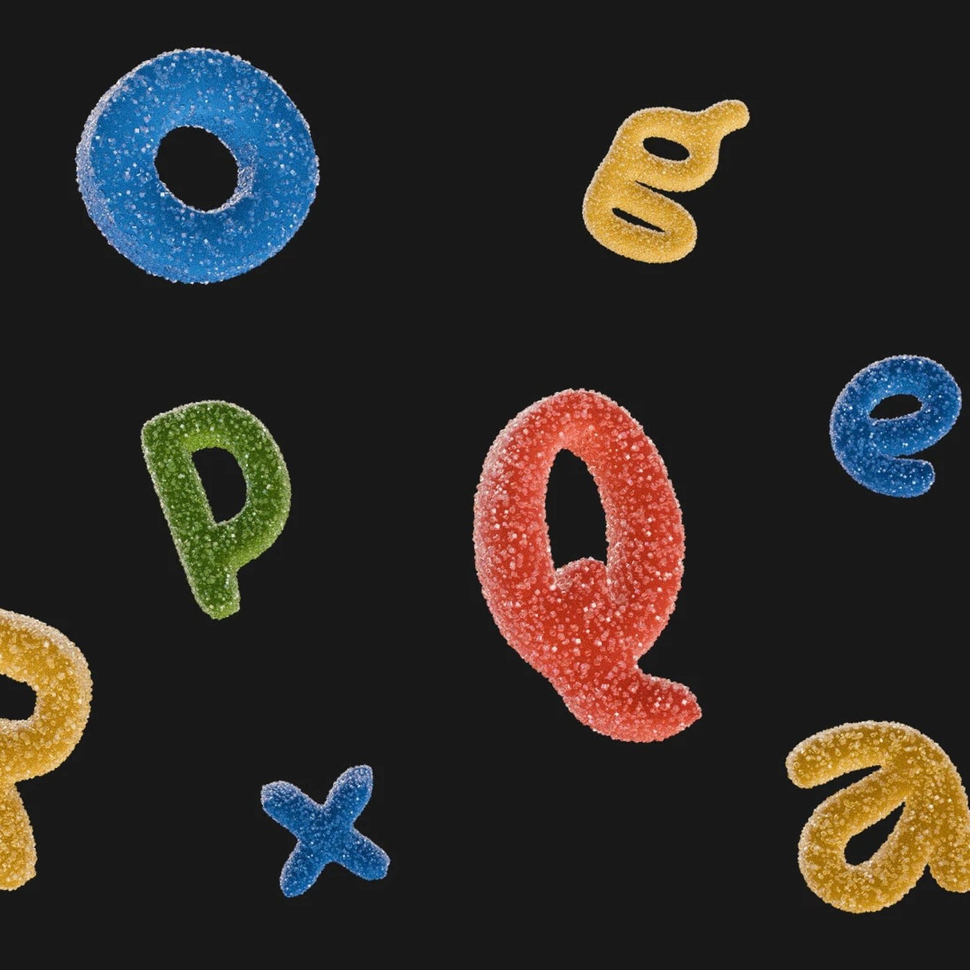
Best Designs of the Week: Modular Systems and Spatial Layouts
Abduzeedo's weekly design selection examines modular systems that provide flexibility in modern projects and innovative spatial layout trends that optimize user experience. The roundup emphasizes the importance of scalable and functional approaches in the design world.

The Blank Page Fear and the Illusion of Perfection: Initial Barriers in Digital Product Design
The initial resistance caused by a blank page in digital design and the perception of untouchability generated by flawless designs are two core psychological barriers that negatively impact creative processes and teamwork. To accelerate design workflows, starting projects with raw drafts and emphasizing that interfaces are continuously improvable play a critical role in overcoming these hurdles.
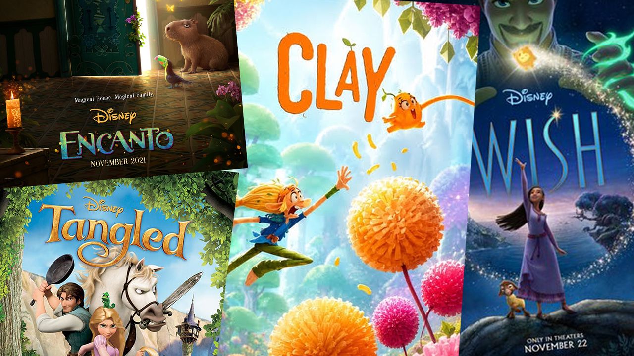
Why Does Disney Prefer Single-Word Movie Titles?
Disney's preference for single-word titles in its popular films offers a strong brand strategy in terms of digital marketing, global compatibility, and memorability. Minimalist titles both facilitate social media integration and provide advantages for visual designs on digital platforms.
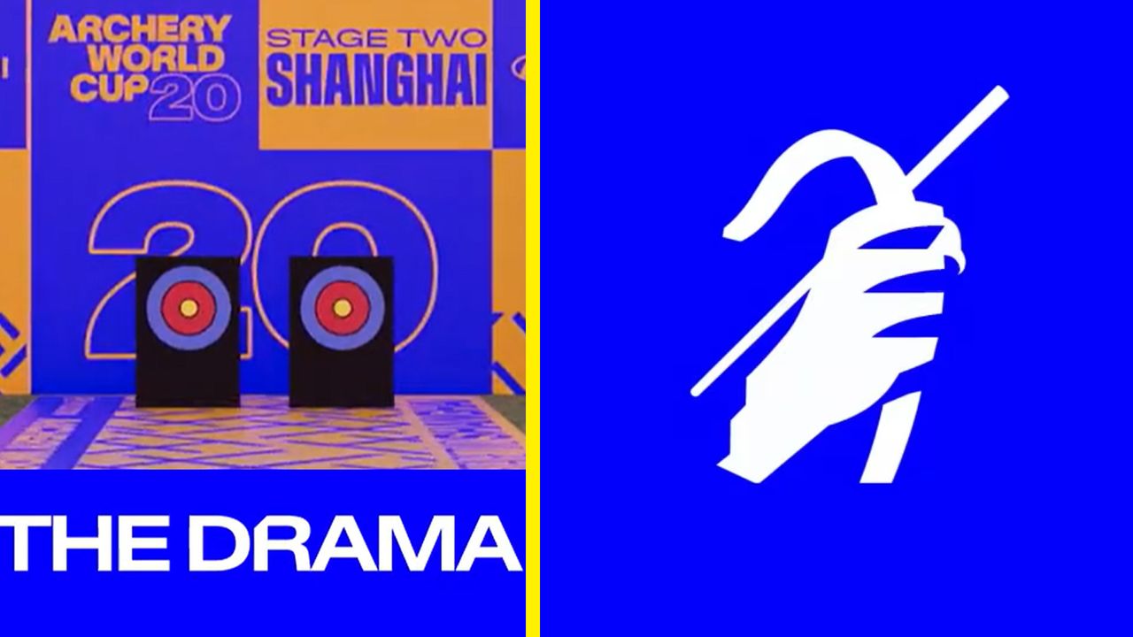
Archery World Cup’s New Identity Sparks Interest in the Design World
The Archery World Cup has undergone a bold visual identity overhaul that has drawn widespread attention in the design world. The new design merges the dynamism of the sport with modern and minimalist graphic lines, setting a striking example for digital marketing and brand communication.
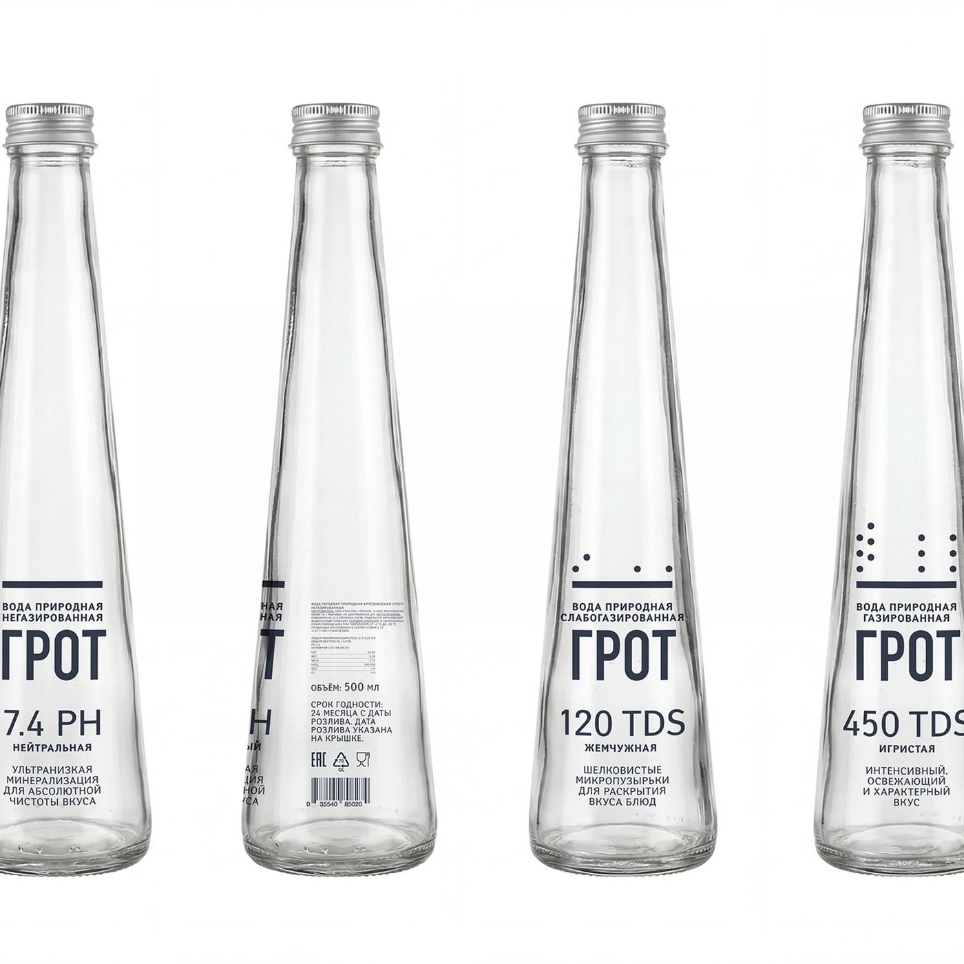
Mariya Churilo Reviews GROT Premium Water Packaging Design
Mariya Churilo's GROT premium water packaging draws attention with its minimalist aesthetics and luxury segment-focused visual identity. The project highlights the impact of packaging design on brand perception and shelf differentiation within the beverage industry.
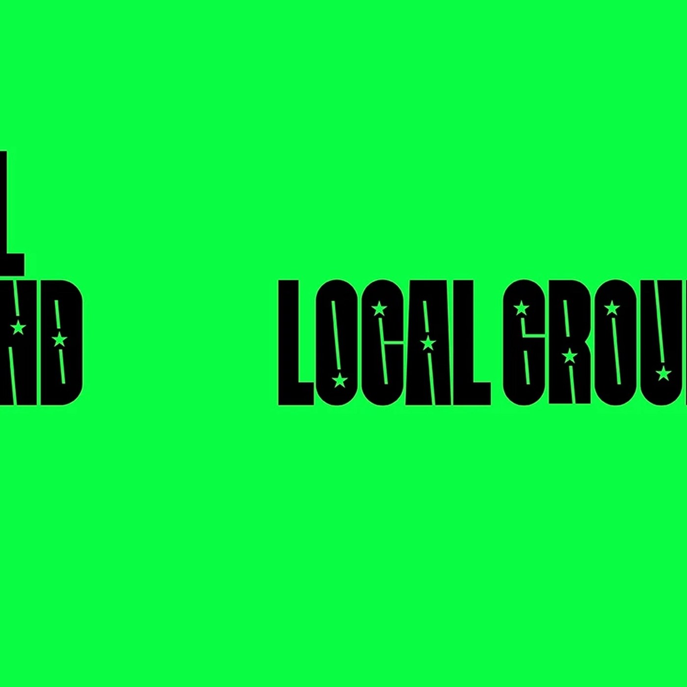
NAVER LOCAL GROUND Visual Identity and MAUM STUDIO’قع Design Approach
Developed by MAUM STUDIO, the NAVER LOCAL GROUND visual identity presents a modern design approach that bridges digital platforms with local and physical experiences. The project draws attention with its flexible grid systems and adaptable brand elements.
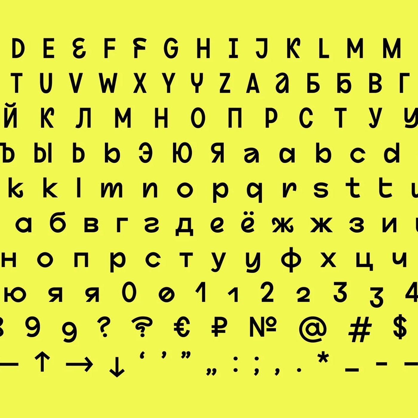
ESH Typeface Typography Project Designed by ESH Gruppa
Developed by ESH Gruppa, ESH Typeface is an original typography project optimized for modern design projects and brand identities. With its geometric forms and readability-focused structure, the typeface offers versatile usage in both digital and print media.
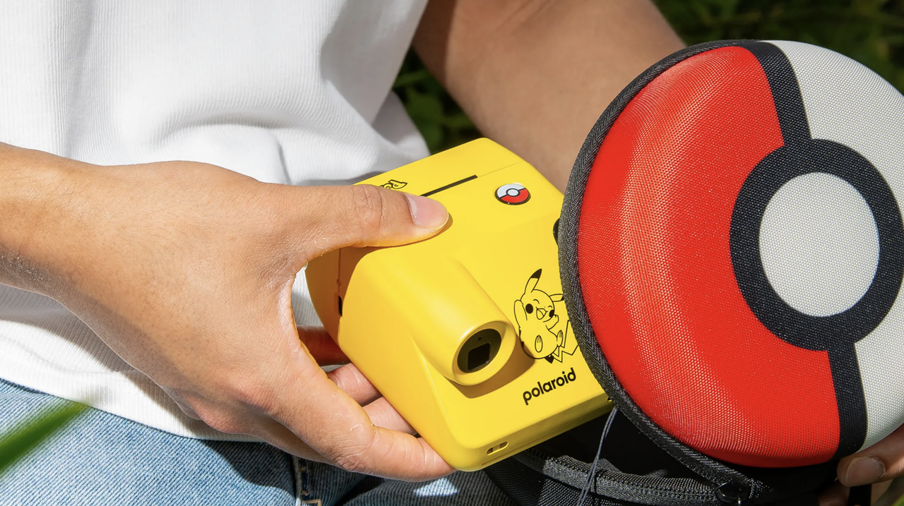
Polaroid and Pokémon Collaborate: Design Details and Expectations for the New Cameras
While Polaroid's new Pokémon-themed instant cameras offer a nostalgic charm, they have drawn criticism for not sufficiently reflecting the characters' distinctive traits in their design. Although they may not fully meet design expectations, the products are closely followed by collectors and pop culture enthusiasts alike.

A New Era in AI and Digital Design: Test Author AI-Designer
Test Author AI-Designer offers next-generation features that accelerate workflows in the fields of artificial intelligence and digital design. This system provides designers with practical solutions and automation opportunities in creative processes.
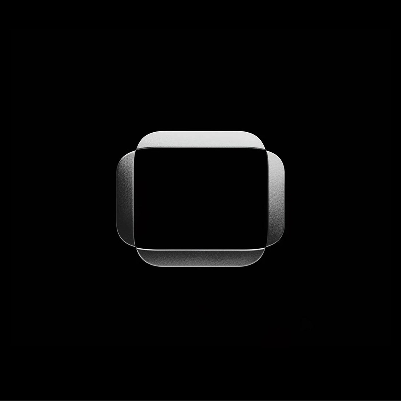
Mission Space Visual Identity: A Space-Themed Branding Project by SANDS STUDIO
Developed by SANDS STUDIO, the Mission Space visual identity offers comprehensive branding for space-themed technology startups, combining modern aesthetics with functionality. Through the harmony of its typography and color palette, the project establishes a consistent corporate language across both digital and print media.
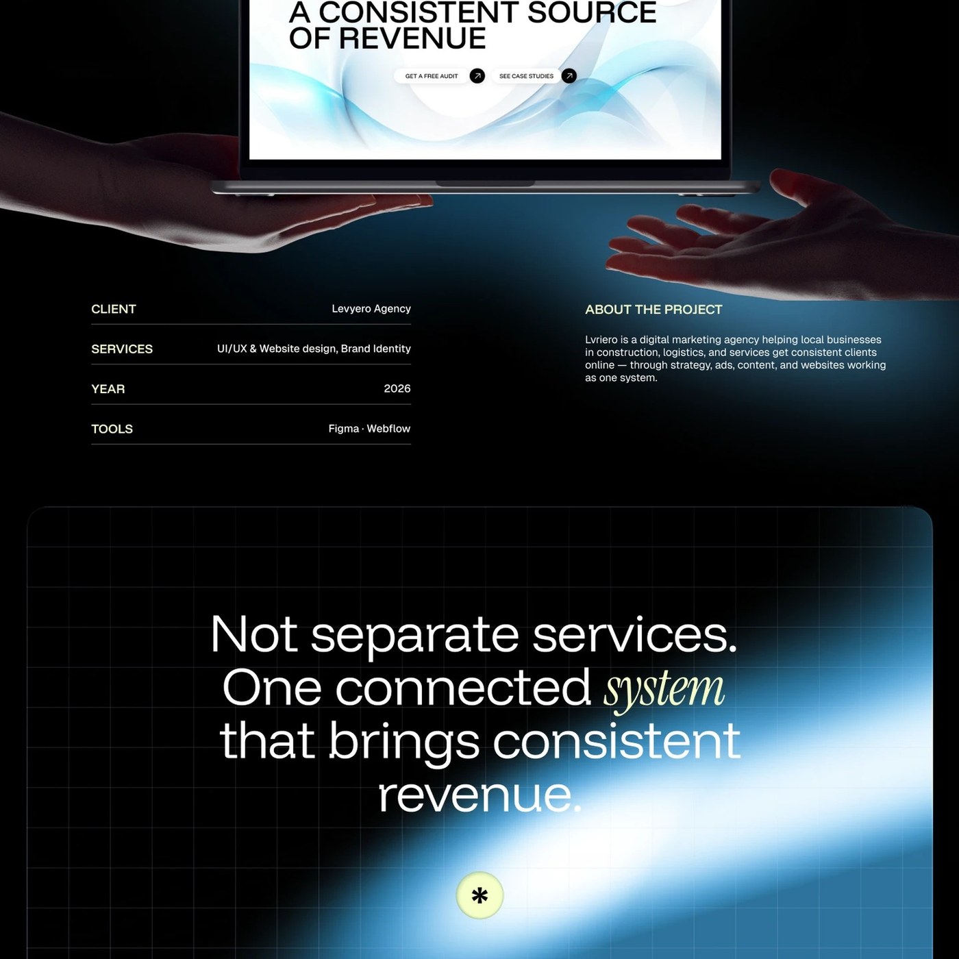
Levyero UI/UX Project Designed by Anna Mahdina is Live
Designed by Anna Mahdina, Levyero is a modern UI/UX project that approaches digital marketing systems with a revenue-driven mindset. The project highlights design dynamics aimed at boosting conversion rates by pairing complex data with user-friendly interfaces.
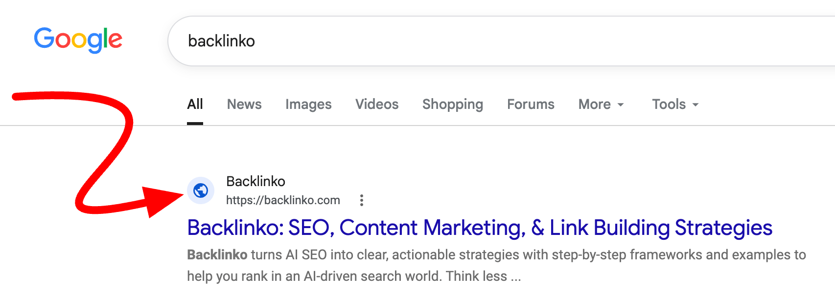
Fix on the Way for Favicon Glitch in Google Search Results
Google has confirmed that it is working on a technical bug causing website favicons to display incorrectly in search results. While officials stated that the issue stems from their own systems and will be resolved as soon as possible, webmasters are not required to take any action.

What Is Tech Stack Consolidation? A Guide to Unified Systems for Businesses
Tech stack consolidation is the process by which companies reduce their software tools and combine them into a more integrated system. This guide explores ways to prevent tool sprawl, the importance of using a centralized CRM, and the strategic advantages it provides to businesses.

10 Social Media Interaction Types to Master for a Successful Digital Strategy in 2026
According to Hootsuite data, there are 10 social media interaction types that must be mastered in 2026 strategies. Measuring the quality of intent-driven interactions such as comments, shares, and saves is vital for brands to prove their digital success.

Up to 30 Percent Discount Campaign Launched on Wall Shelves
A discount campaign of up to 30 percent has been announced for hanging shelves featuring rustic walnut and sleek oak designs. Offered for those looking to optimize their workspaces and home decor, these designs provide both aesthetic and functional storage alternatives. The campaign specifically targets users who place importance on interior organization.

How to Measure Creator Value in Digital Marketing: Parasitic Reviews and Incrementality
The true value of review creators in marketing is uncovered by measuring parasitic effects and interdepartmental duplicate payments through incrementality analysis. Collaboration among company marketing teams is critical for budget efficiency and accurate data tracking.
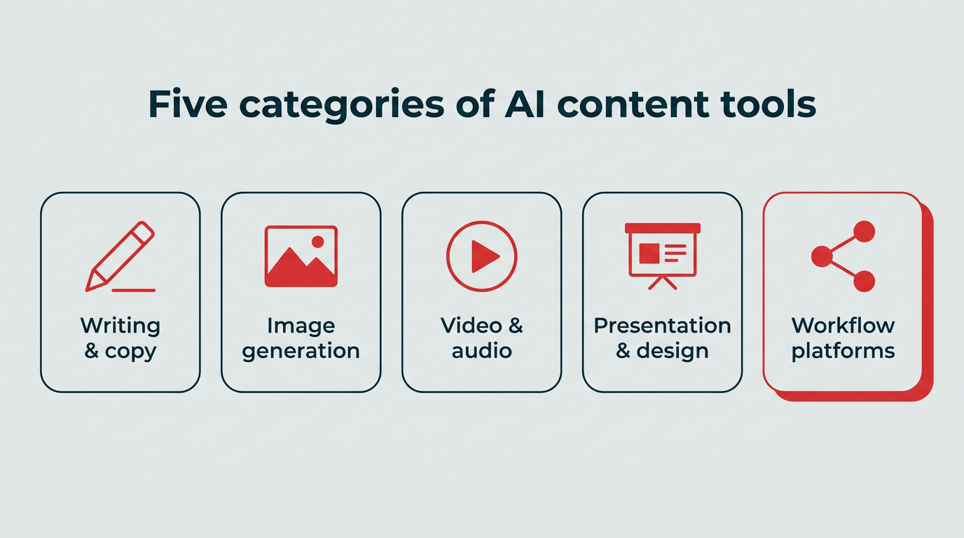
Best AI Content Creation Tools and Next-Generation Features for 2026
By 2026, AI content creation tools have advanced beyond basic text generation into multimodal systems that protect brand voices and integrate seamlessly into workflows. With the market projected to reach $394.66 billion, teams are increasingly turning to unified platforms for efficiency, while keeping strategic decision-making firmly under human control.
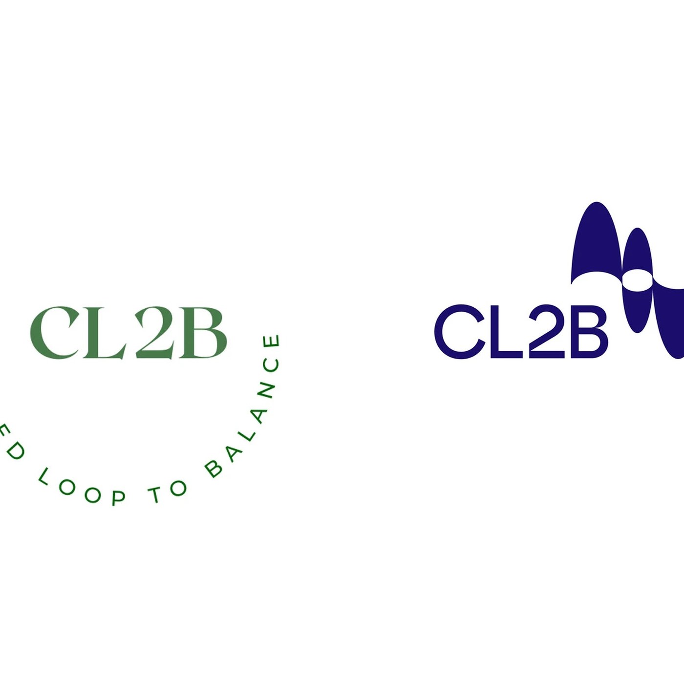
CL2B by Favor Design: Brand Identity Through a Closed-Loop Design Approach
The CL2B project by Favor Design introduces a closed-loop approach that combines sustainability and visual balance in brand identity design. The project aims to create an integrated brand ecosystem where all design elements feed into one another.
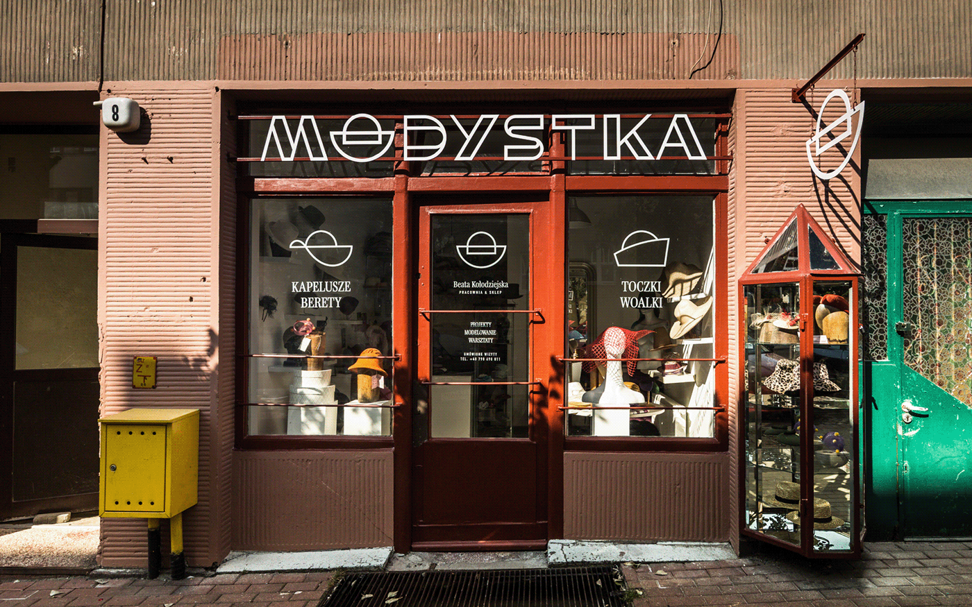
Modystka Store Design and Signage Brand Identity Revamped
The Modystka store has carried out a comprehensive renovation project covering its architectural design and signage brand identity. This visual update aims to enhance the business's street-level visibility and deliver a modern, cohesive brand experience.

Samsung Galaxy S26 FE Colors and Specs Leaked: All Details on the New Model
The color options and technical specifications of Samsung's anticipated Galaxy S26 FE have leaked. Confirmed to launch in Blueberry, Pistachio Green, and Graphite, the device packs powerful hardware details such as the Exynos 2500 processor, a 6.7-inch 120Hz AMOLED display, and a 4,900 mAh battery with 45W fast charging support.
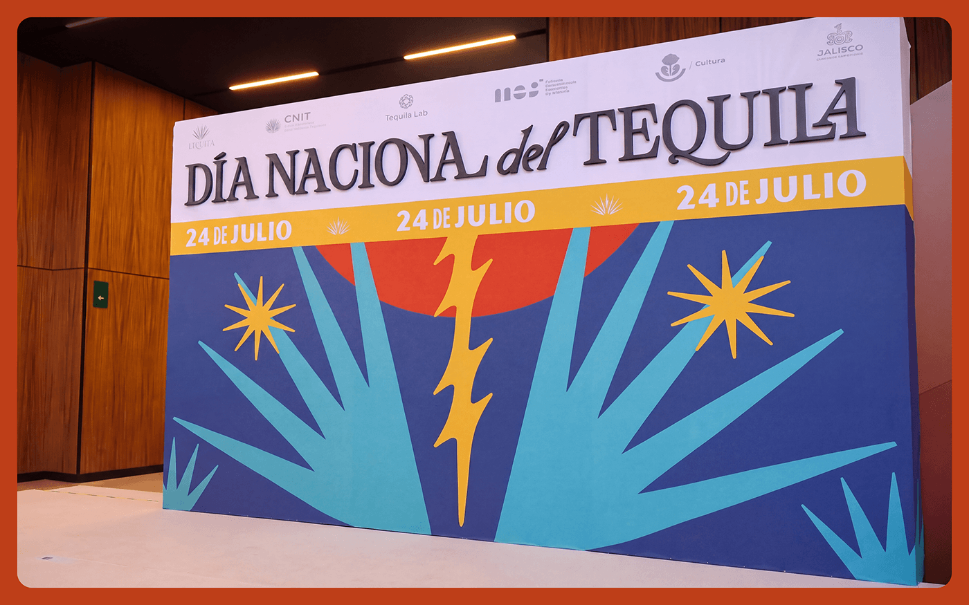
Dia Nacional del Tequila: Special Poster and Bottle Design Illustration
The special poster and bottle design illustration created for Dia Nacional del Tequila merges traditional cultural motifs with modern graphic and packaging design trends. Featured on Abduzeedo, this concept work offers an inspiring approach for visual arts and thematic marketing projects.

Why Was the Mercedes W124’s Right Mirror Smaller? The Secret Behind Its Engineering and Design
The difference in size between the right and left mirrors on the Mercedes W124 is not an aesthetic flaw, but a deliberate engineering decision designed to optimize the driver's field of vision. Tailored to the driver's position on the left, this asymmetry was intended to ease parking maneuvers, especially on the narrow streets of the 1980s. Although modern technologies have eliminated the need for this physical design approach, this detail remains one of the functional engineering examples that make the W124 iconic.
Why Are AI Labs Buying Pre-2022 Books?
AI labs avoiding low-quality content by purchasing pre-2022 books and developing text watermarks indicates that mass content production strategies will lose value in the future. This shift elevates the importance of original and quality content over quantity in digital marketing.
The Era of Generated Interfaces on Google Search: Interactive Tools Will Appear Directly in Search Results
Google is testing a "Generated Interfaces" feature that creates interactive tools directly within search results via its AI Overviews infrastructure. Tests show these generated interfaces are preferred over traditional tool pages, signaling a new era for SEO and digital marketing strategies.